Showing posts with label EKS. Show all posts

Saturday, May 23, 2015

hello flowers

Hope you are having a beautiful Memorial Day (if you're in the US) or Pfingsten (if you're in Germany) weekend. I'm sharing a card I made based on two challenges whose deadlines I totally missed. But I'd had the idea and had even made a start... so I finished it up to share.

Saw this gown at RIC. If you look closely, you'll see that those are actually photos of the blooms on the fabric. At least I think they are. Which had me wondering how to recreate that vibrancy.


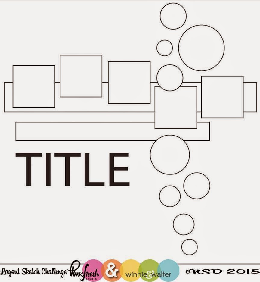
Saw this sketch during the Winnie Walter/Pinkfresh iNSD week.

I had decided to vibrantly watercolor some In Bloom: Addie's Garden blooms, then fussy cut them and adhere them to black CS. Didn't really know what I'd do after that. So I did some no-line watercoloring. Put them to the side to dry. And forgot about them.

Then the sketch prompted me to think about punching portions of the blooms on squares and circles (still fussy cutting the blooms and then adhering them to black squares and circles). Well I got real lazy on that one and just punched portions of the blooms. And this happened.


The design reminds me of a wall in an art gallery (not cuz of the quality of the painting!). Although I must admit I am happy with how the yellow tulip turned out.


And notice how the circles also made their way into my design? (And stray glitter from that dang Ranger Enchanted Gold embossing powder!)

I'm joining in at:

Craft Stamper - Take It, Make It for May to use a stamp
Uniko Studio - #21 Flowers (Happy Birthday to Bev!)

Have a great weekend. I appreciate your visit.


Tuesday, March 10, 2015

STAMPlorations stencil blog hop day 3

Hope you've enjoyed the STAMPlorations DT's work with stencils this week. I've got the last in my trio of 20x20cm canvasses I made as thank you presents for my cousin's kids. Today's is for the 12-year old gal whose new room looks like this.


I took my inspiration from the colors (blues, green and brown) and circles.


First I watercolored a piece of watercolor paper with Distress Inks in Tumbled Glass, Broken China, Shabby Shutters, Tea Dye and Gathered Twigs. Splattered some turquoise Glimmer Mist onto it too. Let it dry then punched circles in various sizes.


For the canvas I started with the Bold Florals stencil from ARTplorations and some turquoise and blue paint. Notice how I carefully placed the stencil to only place a few blooms on my background. BTW, I use a sponge brush for this. You can see it in the upper left corner of the photo.


Then I played with the punched circles, deciding where to glue them down. Used Matte Medium to adhere them.


I covered the Tim Holtz grungeboard A with some old K and Co. PP (used a glue stick, brayered over it and then trimmed around the grungeboard with a craft knife). The Prima paper flowers with gem centers were strategically placed. To cover two creases which happened when I not-so-cleverly ran the A through my Big Shot! I also inked the edges of the alpha with brown to cover the grungeboard edge and define the letter better.

So it ended up looking more "tropical" than "circle-y", but I hope she likes it.

Hope you enjoyed the hop. I appreciate your stopping by. Have a great rest of the week.

Tuesday, January 14, 2014

cool. congrats. (SSS, CASology)

I would love to share a page from the February 2014 issue of Paper Crafts and Scrapbooking with you... but I can't figure out how to do it.  (I was so excited to be sharing p. 52 with Asty P., a new pal from WCMD 2013).  So I'll just have to share my card.


I LOVE this card.  Why? It's all about the UNEXPECTED, folks.

Of course when I was creating the front panel I was working with straight lines.  Punched squares, halved them on the diagonal and then glued them down.  But when playing around with the finished piece of paper with the squares/triangles on it (it was larger than the card front) I skewed it a bit and fell in LOVE.  The UNEXPECTED, ya know?!?!? And because I had skewed it,  the design didn't cover the entire card but that was my next eureka moment!  I just trimmed along the CS triangles and love the bit of white card left to peek out.

I hadn't really known exactly where I was going with this card (I seldom do), but when the eurekas were over it became apparent (to me!) that it was an iceberg.  So... enter the sentiment. Which BTW is computer-generated for those of you who don't own a Dymo.  Here's the font.

I'm joining these challenges:
Simon Says Stamp Monday Challenge - Anything Goes
CASology - #77 Bubbly

Bubbly? you ask.  Here's the deal.  We drink carbonated mineral water in our house.  And refer to it as "bubble water".  Bubbly... bubble... water... iceberg... see?

Check out the mag if you haven't.  In case you're still looking for ideas using hexagons, there's lotsa inspiration.


Appreciate your visit.  Have a fantastic week.


Supplies cool. congrats.:
Paper: cardbase Bringmann, other DCWV+
Stamps:  none
Ink:  
Tools: square punch
Other: free font for sentiment


Tuesday, July 16, 2013

parade of rejects: quince hues (CFC)

Back to the rejects.

So, there was this submission call to create cards using Design Seeds color palettes.  Love those.  But to create a card based purely on a color palette (no white or black allowed!) is truly challenging for me.  So many possibilities and that makes my life SOOO difficult.  I cannot wait to see the cards selected for that issue!

I went with a design I had used earlier and made a baby card cuz I thought the colors would work.

Image Credit


quince welcome baby

Some misting, some PP circles, some stitching and sequins.  A less-than-perfectly-aligned stamped sentiment... was that the kicker?  Or too many colors in the PPs.  Don't know.  Never will.  That's OK.  It's been used already :)

I'm joining the challenge at CASual Fridays #109 cuz I've got dots even if they're not doing the polka.

Thanks for watching.  More from this series to come.


Supplies welcome baby:
Paper: CS Papermania, PP October Afternoon
Stamps: Paper Smooches
Ink: Glimmer Mists spray ink, Versamagic
Tools: punch EKS, sewing machine
Other: sequins

Tuesday, May 7, 2013

teenage motivation #2 (CFC)

It's Tic Tac Toe over at CASual Fridays 2nd Birthday Challenge.  I went with B/W, text and a punch.  It's the second of the journals I personalized for my tutor kids.  For an 8th grade boy this time.


Saw the idea of the flair with twine on a notecard in a recent issue of Paper Crafts.  Hope said boy will actually use this...

Thanks for looking.


Supplies Journal believe:
Paper: notecard
Stamps: sentiment PC generated
Ink: 
Tools: border punch EKS
Other: journal Aldi, letter sticker and twine Making Memories, flair ?

Friday, October 26, 2012

chicken soup for the soul (SCS, CPT, WMS, Retro)

Two cards comin' at ya.  First one was fun. And oh so difficult.

Listen to this chicken soup challenge (HYCCT1223): "use a chicken (hens and roosters are acceptable too ) on your card, and elements that spell the word S-O-U-P."   BTW, Sabrina, the hostess chose this because she remembers cooking up chicken soup for a friend every time she had chemo.  What, pray tell, starts with a "U"?  Think about it!

Here's my card.  Can you find my S, O, U and P elements?  Bet not.


Methinks this will work:
S:  Stickles, scallops
O:  oval, orange
U:  UNEVEN STITCHING
P:  pink, plaid

I was inspired by the colors and crepe paper treats from The Creative Paper Trade's third challenge too.


Followed the sketch from Waltzingmouse Challenge #120 and used Waltzingmouse stamps.  I'm so glad I treated myself to  that Frenchy set with Mr. Rooster.


Second card is for HYCCT1217 to decorate the edge of your card.  I also used the Retro Sketches #34.


I love original card from Laurie W.  I actually have that PTI stamp (it's not seen ink yet). May have to give it a whirl.  Used some Tim Holtz stamps on K&C PP for this notecard.

Whew!  Thanks for coming by.  Happy Weekend ya'll.


Supplies card #1:
Paper: cardbase Papermania, CS Neenah, digi paper The Creative Paper Trade
Stamps:  WMS
Ink: Adirondack
Tools: die Spellbinders, sewing machine
Other: crepe paper, Stickles, buttons Sew Sweet

Supplies card #2:
Paper: PP K&Co
Stamps:  Tim Holtz Stampers Anonymous
Ink: Distress Inks
Tools: punch EKS
Other: button Sew Sweet, embroidery floss

Tuesday, October 23, 2012

It's beginning to feel a lot like... halloween (Artful Delight, SSS, SCS)

Check out this loaded storyboard from Simon Says Stamp's Challenge.   Well, hello Halloween.


Couldn't get that bowl of m&m's outta my mind.  Mostly cuz I'd love to look at 'em all day, little bit cuz I'd love to eat 'em.  I admit it.

This is what came of my inspiration.


And I've been dying to use these new bad boys from Stampotique and finally got around to it.   I love the photo of the crashed witch with the striped tights!  So wicked.


Used this month's sketch challenge from Artful Delight.


Am also playing with the challenges at Splitcoaststampers for Breast Cancer Awareness month - Hope You Can Cling To.  A challenge a day (yeah, I'm late to the party, so what's new?!?).  On the first I used 3 punches and a die (HYCCT1206).  On the second, strips (HYCCT1204).

Have a great one.


Supplies Boo:
Paper: cardbase Papermania, PP KI Memories, CS DCWV
Stamps:  Paper Smooches
Ink:Versafine
Tools: dies Sizzix, punches EKS
Other: googly eyes

Supplies How many fingers?:
Paper: cardbase Papermania, PP KI Memories
Stamps:  Stampotique, sentiment Inkadinkado
Ink: Distress Ink, Cat's Eye
Tools: 
Other:

Monday, October 15, 2012

loving sequins (CAS(E), SSS, I am Doe)

Quick post for a quick card.  Had the idea and it came together like I hoped.  And I used up some sequins from my stash.  How great is that!


Picked a great 6x6 pad and punched some 1" circles from it.  Adhered them to cardbase.  Masked them with 1 1/4 " circles and spritzed some Dylusions ink.  Placed sequins then stitched over them.  Stamped sentiment.

All came together cuz of this sketch from the 1st challenge at the new site, CAS(E) This Sketch.  If you love CAS you better check them out.  A great DT at work.


The idea with the sequins came from Shanna's layout over at I am Doe.  Just love it.

And why not one more entry over at Simon Says Stamp's Die and/or Punches challenge.


Have a great week.


Supplies congrats:
Paper: CS and PP American Crafts
Stamps: Paper Smooches
Ink: Dylusions spray ink, Versafine
Tools: punch EKS, sewing machine
Other: sequins


Thursday, September 20, 2012

washi misted veneer windows (Retro, I am Doe, Moxie Fab)


This was another of those journey cards.  Many detours.  What it came down to was a new mask and a new Glimmer Mist (Puerto Rico = periwinkle if you remember the Crayola box of 64) which still hadn't been put away properly.

And these two challenges.  The sketch over at Retro Sketches.

And this "sketch" over at I am Doe.  You may have heard of Freckled Fawn.  They have the cutest product pictures, always staged with an adorable fawn statue.  There is now a challenge at the blog.  And who wouldn't love to own some more of the adorable washi tape they carry?


I did myself no favor by combining the two challenges.  They have little to nothing in common.  But then I looked at the layout from I am Doe and reduced it to the elements that caught my attention.  And those were:  washi tape, typology, blue and pink and everything very soft and fuzzy as if in a fog.


Thus the misted image.  The vellum windows with the blue and pink birdies underneath.  The distressed typewriter sentiment.  And the washi.  Of course.

TIP:  Be aware if you apply Distress Ink to wood veneer shapes, they turn out A LOT darker than the original ink color.  That veneer birdie is supposed to be Shaded Lilac which was actually a pretty good match for the Puerto Rico Glimmer Mist.  Maybe I shoulda misted Mr. Bird.  Hmmm.

Adding this to the list over at Moxie Fab's Gallon, Quart, Pint challenge cuz I consciously made the decision to overdo the blue and then add the yellow and pink proportionately.

Thanks for visiting.


Supplies Happy Birthday:
Paper: card base Buttinette, CS Neenah, recycled vellum
Stamps: birds Artemion, sentiment The Craft's Meow, template Crafters Workshop
Ink: Distress Ink, Aladine, Glimmer Mist
Tools: punch and corner rounder EKS
Other: veneer Studio Calico, washi Bella Blvd.

Sunday, September 9, 2012

creative thinking required (TAWS, JayGee, SSS)

Both of these inspiration photos totally spoke to my Marimekko heart.  The first is the current challenge at The Alley Way Stamps, the second JayGee's Nook.


See the pillows?  See that "ric rac" one?  I have a ric rac die.  But, having no Alley Way Stamps in my stash, I perused the freebies on their site and found a great sentiment that fit the ric-rac-turned-water motif.  Add a stamp from my stash and this is the result.


Pretty self-explanatory.  Printed the digi image.  Stamped.  Added die cut strips.  Thanks for checking it out.

Entering this to Simon Says Stamp's challenge to Stamp.  Cuz I did.  Digitally and with inky fingers.


Supplies just keep swimming:
Paper: card base Papermania, CS Coredinations
Stamps: digi The Alley WayStamps, EKS
Ink: Adirondack
Tools: die Cottage Cutz
Other:   

Wednesday, May 9, 2012

Wo bin ich?

Followers.  People who like what you do.  And want to see more.  I get it, I really do.

But at the moment I'm up to my eyeballs in dealing with an errant teenager and trying to figure out how to be a more effective parent.  I'm actually learning new things.  Actually very interesting stuff.  But VERY energy consuming.

And technology.  Don't know if the problem is Blogger.  Or my PC.  Or the strange sites that are "hitting" my PC from somewhere in remote Russia.  But this is definitely taking the fun out of blogging.

And I guess it's also eaten my mojo.  Never really knew what that meant when people would write that their mojo had disappeared.  Now I get that too.   Got a list of cards I need to make.  With dates nearing.  But I find myself lured out into the sunshine instead of downstairs into my laundry room when I need to clear my head.

Just thought I'd tell ya'll that, in case you were NOT happy about one less message in your reader :)

Figures I could share an old project with you that I did for my parents.  After a great weekend spent with them in downtown Detroit (their old "stompin grounds) to celebrate their 60th anniversary.  Detroit Institute of Arts.  Belle Isle.  RenCen.  Hart Plaza.  City County Building.


The photo shows just the innards - the final product was an 8x10 picture frame.  Not that it was spectacular or anything, but it was so much fun to make and they really enjoy looking at it and remembering our time together.

I had sent them 20 of the best photos from the weekend, so when I punched out interesting portions of my copies of those 20 and arranged them here, they were able to recognize them.  And they had a blast doing it  ("Oh look.  Those are my feet...")  And I had a blast using my circle punch - moving it around on a photo to see what looked good... 

After that I just added some Staz-On stamping onto acetate and put it into a frame.

Bis bald...  and may the mojo return.

Saturday, April 21, 2012

artsy fartsy (using scraps)

Watercolor butterfly in some way.  Or so I thought until I looked closer at the Tuesday Trigger from Moxie Fab World.  Those "lines" down the sides of the dress from See by Chloe are actually ties made from the same fabric and woven crisscross through eyelets!

So that was the road my creative process took me.  Weave twine through eyelets and use a watercolor butterfly.  But as I thought about the "ties from the same fabric" I remembered an oh-so-cool card from Alicia T. in the Moxie Fab Paper Scraps challenge, with a butterfly made from strips of scraps.  And then I thought of the scrap paper I stamp off on and save, always thinking I'll be able to do something with it.  It's kinda artsy fartsy.


So looking at Alicia's card I figured the "scraps" had been strips of paper.  So I cut a few and bent them - and they didn't look like a butterfly.  Hmmm.

Now spatial thinking has never been my forte.  Just give me a story problem about a house with the dimensions X and a roof with the angle Y and you'll raise my blood pressure!  Figured it must have to do with straight lines versus curves...

So, what if I took an oval outline.  Nope.  Maybe a circle.  Yep.  Ended up using my circle scissor to cut a 2 3/4" circle and then a 3 3/8" circle around the negative space to get a circle outline that I snipped at one spot and bent into shape to make one side of Miss Flutterby.


Same process for her other side and glue dots to hold them together.  Recreated the crisscross effect I originally wanted to go with by embossing (sideways) a portion of my card.  Distress inked the edges and swiped a little Worn Lipstick and Tea Dye over some of the raised Xs.  Mounted the butterfly on a circle cut from some recycled packaging so she could be resting on a dahlia.  Distressed its edges too.  Finished the butterfly with a threaded button (left the thread long like antennaes) and added a couple pearls.

A somewhat different take on the Trigger, but I'm so happy I figured out how to make Miss Flutterby.  Wouldn't she be cute decorating a gift?

Appreciate your looking.  Hope your weekend's springy.

Supplies :
Paper: card Buttinette, packaging, scrap
Stamps:
Ink: Distress Ink
Tools:embossing folder Sizzix, circle scissor and corner rounder EKS
Other: pearls, button Sew Sweet, floss

Saturday, April 7, 2012

innovative stripes (distress inking)


The new monthly contest at Hero Arts:

ha-april2012-sketches

Wanted to use the bottom left sketch but not just strips of CS or PP.  I swear it was one of those lightbulb moments and I had my idea for the stripes.


 Combined several of my fave techniques.  Heat embossing.  Distress Inking.  Stamping with markers.  And of course the great quality Hero Arts Stamps.  Such fun.

TIP:  To minimize alignment problems, rather than stamping the one "inchie" image four times horizontally, I lined up the four stamps vertically as I wanted them on the card.  Then pressed my acrylic block onto them.  Stamped the outside vertical rows, then the inside ones.

Heat embossed with clear powder.  Used two strips of scratch paper to mask the stripes and applied Vintage Photo, Walnut Stain, Pumice Stone and Antique Linen Distress Inks.  Rounded top corner.  Card base done.

I colored the wildflower stamp with markers, spritzed a couple times with water and stamped onto Neenah CS.  Made three images to be able to punch various sections.  Knew I wanted to group the circles rather than use just one.  Played around until I got the combination of images I wanted.  Popped them up at various heights using foam dots.

Here's a second card I made:


This wildflower image is less watercolor-y than the first.  I just love the artsy feeling that comes with playing with this technique.  Each result is different.  You even get more bang for your buck when you spritz again after stamping once.  Taking liberties with the sketch, I chose to place my sentiment on the inside along with a second generation image.


And even dressed up the envelope a bit.


I'm joining the ladies over at the new A Blog Named Hero for their challenge to use some Hero Arts favorites.  I do love this stamp for its versatility.  Used it here.  And here.

Thanks for looking.


Supplies Thinking of You:
Paper: Neenah
Stamps: Hero Arts CL 266 and K4880
Ink: markers, Distress Inks Ranger
Tools:  corner rounder and circle EKS
Other: clear embossing powder, Mini Mister, foam dots


Sunday, March 4, 2012

With Sympathy (dry embossing)

Very challenging colors for me over at CR84FN - gray, kraft and yellow.  Love the inspiration though.  I swear I can smell those lemons.  If you don't know these ladies, check them out - a  great variety of styles.


Notice the quote:  Happiness is a butterfly...  Thus my new embossing folder.  Again.  Twice.  You decide which one you like better.


Same concept for both.  CS base stamped at edges with butterfly stamp.  Gray dots embossed PP panel stitched with yellow onto CS base.   Some punched butterflies (some heat embossed) adhered to front.  More butterflies and some pearls on #1.  Fewer butterflies and a bigger sentiment on #2.

I made #1 first.  By no means is it a fancy card... but for my taste it was too "heavy".  Thus #2.

TIP:  Use a square punch to make the "V" on a sentiment strip.  Less wonky than snipping with scissors.  And I'm too cheap to buy a die to do it for me.

TIP:  No one likes having to make sympathy cards.  But I enjoy using these stamps from Technique Tuesday when I have to.  Very versatile.

Thanks for visiting.


Supplies :
Paper: PP echo park, CS American Crafts, DCWV
Stamps: butterfly Martha Stewart, sentiment PTI and Technique Tuesday
Ink: Versamark, Versamagic chalk, black Versafine
Tools: punch Martha Stewart, embossing folder Craft Concepts, sewing machine, corner rounder and square punch EKS
Other: embossing powder, pearls