Showing posts with label Creative Paper Trade. Show all posts

Thursday, November 15, 2012

thankful hearts (CPT, CASology, Tim Holtz, SSS)

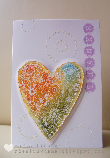
Ever since I saw this inspiration board at The Creative Paper Trade, I had a particular Hero Arts stamp in mind. Finally got around to playing with it.  Twice.


The stamp is a floral heart. The heart made of spools immediately reminded me of it.  I also decided to use the colors from the waterfall photo - ranging from orange on top to green leaves on the bottom with a touch of the light blue water.

I heat embossed the image first.  Then colored it using Distress Inks and a waterbrush.  Then I removed the heat embossing!  using an iron and thin kraft paper.  The result is an incredibly soft and smooth batik look.  It is really a cool technique.  Check out Tim's tutorial here.

To pick up the circles element of the inspiration board I heat embossed a few circles on my cardbase and used a sentiment featuring circles.  Also mounted the heart on vellum, though that's hard to see.


Then I thought maybe I would stamp the image with ink and color it with colored pencils.  But I got detoured along the way when I saw the black image on white and decided to go with it.  Adhered it with washi pieces to a black panel framed haphazardly with lines from a Cutter Bee piercing tool.  Three simple gems and voila.

Also playing at:
Simon Says Stamp Challenge "Thanksgiving/Thank You"
CASology Week #19  "Thanks"
Tim Holtz "Twelve Tags of November"

I'm so thankful for this wonderful hobby!  And your visits, friends.


Supplies for Thanks:
Paper: cardbase Papermania, recycled vellum
Stamps:Hero Arts, circles Stampendous
Ink : Distress Inks, Versamagic, Versamark
Tools: scissors, sewing machine, old iron
Other: embossing powder

Supplies for #2:
Paper: cardbase Buttinette, CS Ursus and Neenah
Stamps: Hero Arts
Ink : Memento
Tools: Cutter Bee piercing tool
Other: bling, washi Rayher

Monday, November 5, 2012

vellum {heart} stitching (SCS+)

Two more cards for HYCCT - I can see the finish line now...

The first is a shaped card for HYCCT#1210.  What shape would I pick?  A heart of course.  Which reminded me of the Valentine candies.  Which reminded me of the word "hugs".  Which led to this.


Die cut the card shape, letting the very top of the heart die hang over the edge of the folded CS to preserve the fold.  Die cut the vellum heart and letters in one pass.  Masked and inked the colored stripes.  What better way to attach the vellum than with stitching.  And I opted to do two passes - one with purple twine, one with green for a bit of variety.  A touch of bling and voila.  A "clearly" handmade card.

Also linking this up to:
Simon Says Stamp - Get in Shape
Moxie Fab World - Stitching and Sewing
The Creative Paper Trade - Week 4


Second card is for HYCCT#1208, cleverly called "HYCCT".  Use something that starts with an "H", "Y", etc.  Stumped me for awhile.


Took the Skipping Stones Design sketch and went from there.


H = heat embossing, Hero Arts flower stamp
Y = yellow (original, eh?)
C = cardboard
C = cyan blue for the flower
T = tag, TCM sentiment

Whew.  Three more HYCCT cards to go if my tally is right.  "Five Words" , "Ruff" and "Lick this Thing."  Thanks for stopping by.


Supplies for #1:
Paper: cardbase Papermania,  vellum
Stamps: none - wow
Ink : Adirondack
Tools: heart die Sizzix, alpha die PTI, needle
Other: baker's twine, bling

Supplies for #2:
Paper: cardbase Papermania,  PP K&Co
Stamps: flower Hero Arts, sentiment TCM
Ink : Versamark, Versacolor, Adirondack for swipe
Tools: die MFT, circle punch, sewing machine
Other: lace scrap


Friday, October 26, 2012

chicken soup for the soul (SCS, CPT, WMS, Retro)

Two cards comin' at ya.  First one was fun. And oh so difficult.

Listen to this chicken soup challenge (HYCCT1223): "use a chicken (hens and roosters are acceptable too ) on your card, and elements that spell the word S-O-U-P."   BTW, Sabrina, the hostess chose this because she remembers cooking up chicken soup for a friend every time she had chemo.  What, pray tell, starts with a "U"?  Think about it!

Here's my card.  Can you find my S, O, U and P elements?  Bet not.


Methinks this will work:
S:  Stickles, scallops
O:  oval, orange
U:  UNEVEN STITCHING
P:  pink, plaid

I was inspired by the colors and crepe paper treats from The Creative Paper Trade's third challenge too.


Followed the sketch from Waltzingmouse Challenge #120 and used Waltzingmouse stamps.  I'm so glad I treated myself to  that Frenchy set with Mr. Rooster.


Second card is for HYCCT1217 to decorate the edge of your card.  I also used the Retro Sketches #34.


I love original card from Laurie W.  I actually have that PTI stamp (it's not seen ink yet). May have to give it a whirl.  Used some Tim Holtz stamps on K&C PP for this notecard.

Whew!  Thanks for coming by.  Happy Weekend ya'll.


Supplies card #1:
Paper: cardbase Papermania, CS Neenah, digi paper The Creative Paper Trade
Stamps:  WMS
Ink: Adirondack
Tools: die Spellbinders, sewing machine
Other: crepe paper, Stickles, buttons Sew Sweet

Supplies card #2:
Paper: PP K&Co
Stamps:  Tim Holtz Stampers Anonymous
Ink: Distress Inks
Tools: punch EKS
Other: button Sew Sweet, embroidery floss

Thursday, October 25, 2012

seeing stars for Papertrey blog hop (PTI, CPT)


It's time to blog hop with Papertrey... but you already know that, don't you?
Let's get to it.  There are a few really cool color combos to choose from and  I picked this one:
Two grays, two teals and a star.  Here she is.


I wanted to do something with a star cuz I love the look of the right photo in this inspiration board from The Creative Paper Trade.  A twofer so to speak.  See the shine in the photo (mirror, lamp, stars)?  If you look closely you'll see that I used some silver ink on the wreath too.  Gives it that "little something."


Happy hopping.


Supplies Happy holidays:
Paper: cardbase PTI
Stamps:  PTI, tweed WMS
Ink: Memento Gray Flannel, Versacolor Cement, no name Silver, Versamagic Teal and Sea Breeze
Tools: die Sizzix
Other: twine


Wednesday, October 24, 2012

show... me! (CPT, SCS)

In this post I told you about taking "creative liberties" and having an adventure with a card.  Well, I liked the outcome some much I decided to do it again.


This card is going to the Hope You Can Cling To campaign (Splitcoast Stampers).  There is a challenge to "Show What You are Made Of".  In other words, "journey to your stampy happy place and find that go-to design principle that makes you the happiest and most comfortable".

Tough to define your own card style,eh?  I tend to be all over the board.  But I'm slowly getting there...  Colors, but lotsa white space.  No fear of mixing stamp sets. Importance of sentiment font/style.  Hearts, yeah they just make me feel good.  Always include a little one when I sign my name on a card or letter.    All that's missing would be some polka dots cuz they make me smile too.  Oh, and practical gal that I am - easy to mail.

Used the colors from Creative Paper Trade's challenge #3:


And here is another card for the HYCCT category "Peaceful Pink".  I hope someone gets a happy, peaceful feeling when they see this card.  Like a summer sunrise at the lake.


I'm trying to make all my cards upbeat and basically just normal cuz I don't think sick people like to be treated like sick people!

Play along.  Make some cards to send out to the University of Texas Cancer Center.


Supplies celebrate:
Paper: cardbase Buttinette, CS Neenah
Stamps: heart Fancy Pants, sentiment PTI
Ink: Distress Ink, Versafine
Tools:
Other:

Supplies hello:
Paper: cardbase Buttinette, CS Neenah
Stamps: sentiment Hero Arts
Ink: Distress Ink, Versafine
Tools: acrylic block, mini mister
Other:


Saturday, October 13, 2012

better than expected (CPT)

Just picked DS up from a friend's a couple towns over and it is peak season in the vineyards.  Harvest.  In our town they say "in den Herbst" (literally:  in the fall) and with it they mean harvesting the grapes.  Shows you how big a role the wine plays in our area.  I LOVE how there is still such a connection to the earth and Mother Nature.  Except, of course, when I get stuck behind a humongeous harvester on the road and he's only going 10 mph!

What I also LOVE, actually AM ENAMOURED WITH, is this bloom.


This is the prize over at The Creative Paper Trade for the current challenge #2.


You may recall my dilemma with the lavender colors, here.  Well this time I went to my fabric stash and it was easy peasy.  I love how this bloom turned out.

And the card.  Better than expected!  I used a freebie postcard digi from the site as well.  Check it here.


Have a fabulous weekend.


Supplies miss you:
Paper: cardbase Buttinette,  PP Ursus, digi papers Creative Paper Trade
Stamps: Paper Smooches
Ink: Versamagic, Versafine
Tools: scissors, needle & embroidery floss, sewing machine
Other: ribbon scrap, heart bead, felt


Thursday, October 11, 2012

oh so girly sketch challenge (Ellen Hutson, CPT, SSS)

Challenged myself to combine two non-related challenges and this was tough.  Main reason?  Not that I don't have a HUGE stash of paper, but in the lavender category it's pretty much nil.   Took me forever to come up with the colors.  Anyhoo, this was the inspiration piece from The Creative Paper Trade.


Although I love the photo  for Color Week (left), I first had to decide which elements spoke to me cuz I am oh-so NOT oh-so-girly!  I picked the colors (lavenders and pink) and the texture (the white blanket and vase).  And because I wanted to incorporate triangles for Shape Week (right) and also follow this Sketch Challenge over at the Classroom at Ellen Hutson:

this is what I came up with.


The process... hmmm.  Turned the sketch on its side first off.  Printed out some digital papers and the notecard from CPT for my main image.  Stamped sentiment in gray.  Chose white card base.  Dry embossed half of it and stamped some doilies on the other half.  Texture, ya know?  Rounded top corner to balance extra white space on bottom left (embossing folder size problem, ya know?)  Found or made the PPs for my triangles then TIP! punched squares from the PPs, marked the middle point on one edge and using scissors just cut from each outer corner to the marked point.  Since it appears triangles are trending, you might want to learn this trick. Inked edges of triangles and adhered.  Stitched some lace trim over the triangle tops and adhered my focal image with foam dots.  There she is.  Whew!

Thanks for looking.


Supplies It's Your Day:
Paper: cardbase Buttinette, PP Basic Gray and K & Co, scrap, digi papers Creative Paper Trade
Stamps: Viva, sentiment  PTI
Ink: ?, Versafine
Tools: square and corner punches EKS, decorative edge scissors, embossing folder Craft Concepts
Other: lace Buttinette

Monday, September 24, 2012

soft and lovely (CPT, I am Doe, Jay Gee's Nook)

Another quick post to show you a card I made based on the sketch/image over at I am Doe.  Couldn't get this out of my mind.  So many elements I love.  The softness, the typography, the squares and washi.


I used the colors from the color challenge at Creative Paper Trade cuz this photo is just so lovely.  And I used a bit of my scraps from this card I made using a digi notecard from CPT.


And the inspiration board from JayGee's Nook (those pastel "nail polish" dots) has stuck in my head since I first saw it.


Here's my card.  One layer and lovely.


Know how I achieved that soft and lovely look?  Stamping off before stamping the images on the card.  And then I gave the entire card a light layer of white acrylic paint.  Ta da.  Applied the circle and washi over that.

I'm parking this over at Simon Says Stamp's blog because I'm in love with this little stamp set from American Crafts.

Thanks for looking.


Supplies thanks so much:
Paper: card base Papermania, digi paper Creative Paper Trade
Stamps: American Crafts, triple square and bracket sentiment Hero ARts
Ink:Jenny Bowlin, Versafine
Tools: punch EKS
Other: washi Rayher., acrylic paint

Saturday, September 22, 2012

pretty pastel (CPT, Artful Delight)

Doubling up on the challenges for another card.    New to me, the sketch challenge at Artful Delight.  And the color challenge at Creative Paper Trade.


Worked with one of the digital papers -actually a notecard I turned into a  frame - which I was lucky enough to win during Creative Paper Trade's introductory week.  Just love Andrea B.'s combo of pastel colors with modern designs.  Worked with my new Amuse Studio pigment inks in those wonderful hues.  So wonderful you can barely see 'em, eh?

Taking the sketch from Artful Delights pretty darn literally, I opted for a tree (stamping with Teeny Trees from WMS).  For the leaves I used a "you" stamp, also from WMS cuz I wanted to play off the typography challenge also at The Creative Paper Trade this week.

Embellished with one of my homemade chipboard pieces and some washi.  A touch of Distress Spun Sugar around the edges and voila.

Happy Saturday ya'll.


Supplies Happy Birthday:
Paper: card base Papermania, digi paper Creative Paper Trade
Stamps: WMS, sentiment Hero ARts
Ink: Amuse Studio, Distress Ink
Tools: die PTI, punch EKS
Other: washi Bella Blvd., acrylic paint

Friday, September 21, 2012

masculine card helps law of averages (Retro)

OK, so I complained about the many detours I took on this card.  But when I got the idea to make another one using this Retro Sketches sketch and a 6x6 PP pad, the average time per card got knocked back down into the realm of acceptable!

So here's another entry for this sketch and this one is so CAS and so masculine.  I'm a happy camper.


My choice of PP as well as the random lettering was inspired by the Paper Nudge over at The Creative Paper Trade.  Another new blog with great challenges and beautiful products to win.


Happy weekend everyone.


Supplies Happy Birthday:
Paper: card base Buttinette, PP Basic Grey
Stamps: alpha Fancy Pants, sentiment The Craft's Meow
Ink: Versacolor, Versafine
Tools: punch EKS
Other: letter stickers Making Memories


Related Posts Plugin for WordPress, Blogger...