Thursday, June 30, 2016

STAMPlorations 3rd birthday blog hop - day 2


I'm joining the party a day late, but it's a good one! STAMPlorations is celebrating Birthday #3 and hip hip hooray, there's a new product line coming to the store. DIES!!! We'll be showcasing them on days 5-7 so just keep watching ;)

In celebration of Birthday #3 as well as the arrival of owner Shery R.'s adorable little Kat last fall, this is the stamp set released for the party.

Kathryn's Big Wishes
I couldn't resist using delightful little Kat with her closed eyes to make a dreamy birthday card. Meet wafting Kathryn!


Thought the sentiment lent itself well to becoming a balloon string! Love the oversize balloon in this set so I heat embossed it white and watercolored it with Gansai Tambi. I chose a bold, primary color scheme (reminiscent of those large punching balloons that Kmart and the like had when I was a kid - anyone remember those?) and went pretty heavy on the pigment which leaves some shine when dry.


So now it's your turn. There's a linky party with prizes over on the blog, as well as a whole lotta inspiration from the DT. There will be random prizes for comments along the way too. Help us celebrate won't you?


Wednesday, June 29, 2016

a colorful rabble for CASometry 2 and virginia


I've had such fun with Anna K.'s CASometry 2 challenge to use one stamp set to make five different cards. What a great idea and what fun it's been to see how creative card designers are. I'm bringing you a review of my previous cards as well as #5.

For #5 we were to CASE a card from the CASometry 2 Pinterest board where this colorful beauty caught my eye.

I set off with my Essentials by Ellen Up the Happy set and this is what evolved.


Pretty easy actually. I used Strathmore Bristol smooth paper and stamped the butterflies with Distress inks. Then I colored them a little in the center with Zig Clean Color Brush markers. TIP: If you're interested I've a list at the bottom of this post telling you which inks match which markers. Went over them with a wet brush and used some of the color picked up on one butterfly (eg. the purple one) to add some highlights to another one (eg. the light blue one). Just made sure to clean my brush after that so as not to end up with mud.

I die cut the cardbase and the stamped panel with STAMPlorations Crazy Double Stitch Rectangle dies. Added craft foam behind the panel for some dimension. I was itching to add black splatters. And a black sentiment too. But I forced myself to keep it light and airy, so heat embossed the fun sentiment yellow on vellum. This way it can't steal the show from the rabble!

This colorful rabble is joining the colorful gallery over at Virginia' View Challenge too!

Here are my previous creations for CASometry 2:

paired with watercolored die cuts
emboss resist inking with Distress inks
stamping with watercolors
sentiment stamps as a background
 And here's my list of Zig marker/Distress Ink matching colors:

#21 = Worn Lipstick
#23 = Ripe Persimmon
#50 = Mustard Seed
#46 = Shabby Shutters
#42 = Peacock Feathers
#36 = Tumbled Glass
#82 = Seedless Preserves

Have a fantastic day!!!


Tuesday, June 28, 2016

spotlight on liquid pearls

Like texture, shine and pearlescence? Check out my project and tutorial over on the STAMPlorations blog today!


STAMPlorations inspiration #82

It's Tuesday. Time for more inspiration for you over at STAMPlorations. Don't you love to see the different ideas and styles of the DT? My teamies never cease to amaze me.

Here's my contribution. I've had another go at stretching my border stamps.


I used these two stamp sets:

Artsy Border Maker
Born to Roam
True confessions? This was actually the card I was making for my last Spotlight post. But it went south. So I created a different card. But then I decided to salvage (or try to) this one. My problems began when stamping the "frame". First off, my first stamping wasn't perfect. Not owning a MISTI, I had to eyeball it to stamp a second time. And it was slightly off. OK, I thought, it's sketchy anyway. I'll just stamp each segment twice.

Next problemo. I'd measured the circle size so that three stampings would complete it, but alas, it didn't. (I hadn't been careful enough about hitting my penciled circle each time!!) So I had to do some selective inking of one curve and stamp it in the missing space!


And then, since I'd chosen a border stamp that was "open" - the 3rd in the set above (compared to the "closed" one I used here , the 6th in the set above) - I thought the design looked funny with the off-the-edge suitcases. Hmm.

So I sketched over my penciled circle with a Sharpie to "close" it and give the suitcases an edge to go over! And watercolored the suitcases with my Gansai Tambi. And did a pale blue sky wash inside the circle. I do really like the primary colors and the finish on the suitcases. They look nice and leathery.


I actually even forgot to stamp the third segment of my frame a second time! Geez, Maria. But the washi strip is pretty cool, eh? From my spending spree at Tiger on our Hamburg trip.

So, as opposed to inspiration, I hope you've gotten a kick out of my "how not to do its"! Thanks for stopping by today.

I'm sharing this card at Time Out #59 where it's about Masculine with a twist of mixed media. Got some heat embossing and washi happening here for texture so I'm in with the twist!

Over at Addicted to CAS the code word is "Fly". This card is for a guy I used to tutor who is off to Africa for a few months work program. I think it fits the bill.


And I'm playing at Joy Clair June Challenge for the first time with my Masculine theme and using some primary colors.


Wednesday, June 22, 2016

MMCC #24 - reminder

I've got a card for you today, inspired by the "Sunset" challenge still happening over at the MMCC. You still have time to play with us until the end of day June 25th.


Once again, I have a card using sunset colors.


Trimmed CS panel. Inked it with Wild Honey Distress Ink. Used a die cut of PTI Chevron plate as a stencil to ink with Spiced Marmelade. Applied Ripe Persimmon through Prima's Perforated Dot stencil. Spritzed with bronze Perfect Pearls mixture. Splattered with water. Applied Versafine through the Crafter's Workshop Henna Hand stencil. Die cut “u” (Lifestyle Crafts) from vellum and put the negative on my panel. Placed the Crafter's Workshop dot stencil over the negative and applied Versafine through both.. Die cut Sizzix “love” and adhered it. I just love me some graphic images!

A closeup so maybe you can catch the shimmer of the Perfect Pearls. I love that stuff.


So although I didn't actually use stamps, there's lotsa ink on my card as well as:
TEXTURE - die cut and shimmery surface
DIMENSION - die cut and the depth of the various inked layers
TECHNIQUE - die cutting and stencilling

Not sure this fits the bill due to that die cut sentiment, but I'm joining the "Stencil" fun over at One Layer Simplicity. Thanks for visiting!

Tuesday, June 21, 2016

STAMPlorations inspiration #81

More inspiration coming at you today, as well as a sneak peek of a new stamp coming your way for STAMPlorations' 3rd Birthday which is fast approaching!

I was in the "create" mode for the Summer Coffee Lovers Blog Hop when two stamp sets met on my workspace and this card happened. (I may or may not have been in a weird mood that day ;)


Used the little chica from the new set along with Sketchy Coffee Cups. Doctored the sentiment (also from the new set) to make it fit my design. Added a wavy line from Mixed Media Elements to catch my sentiment and keep it from falling off the card ;)

Coloring. My nemesis. I Copic colored the mugs perfectly - in my mind's eye!
Figured I better keep it real and just went for striped tights (LOVE that detail!) and an ombre look to chica's dress. Added Wink of Stella to all the mugs. Cuz I can do that ;) And washi and voila! The sparkly mugs are kinda fun IRL.


Please pop over to the STAMPlorations blog and see what my teamies have created to inspire you.
I'm taking this card over to the Coffee Lovers Hop, of course. Have you joined the fun yet?

Friday, June 17, 2016

summer coffee lovers blog hop

Happy Friyay! Happy coffee! Happy summer! Happy Summer Coffee Lovers Blog Hop! Miss Amy T. has done it again. Wonder how many hook ups there will be this time?!?!?

Now, welcome to my world where the Friyay part is true but summer disappeared before it had arrived and I'm favoring tea over coffee today. Wanna see my card?


This is actually an homage to my Mom's iced tea (yeah, I should have die cut "iced" but it would have been too big!). She brewed it from Red Rose black tea and always added a shot of orange juice. So iced tea in our house was never totally clear. But oh so yummy. And that's how I make mine. The lemon sticker on my card was just for fun ;)

It's actually an homage to my relatives in Fayetteville, NC too. Cuz when they ask you if you want some tea - they mean iced tea and it sounds like "I stay" when they say it ;) Thus my poetic license for my sentiment.


I created my background using Mama Elephant's Trifecta, gray pigment ink and summery colors of Adirondack dye ink. Inked a white scrap to die cut my Papertrey Headline Alpha letters. Die cut "ice" with Memory Box Parker Alpha from a snippet. Added a couple Dymo label sentiments to complete my phrase. Stamped and Copic colored the drink using Simon Says Stamp Adult Beverages.

Have a great time hopping and be careful not to over caffeinate!

Wednesday, June 15, 2016

wassup?

Have to share this silly card with you. And a couple challenges.


Somewhat unconventional perhaps, but this is a guy card. Cuz guys have the stupidest humor. Don't tell them I said that OK?

Pretty simple. I heat embossed Hero Arts Life of the Party dots BG onto my cardbase. Inked Neenah white CS with a selection of rainbow colors of Distress Inks and die cut letters with Papertrey Block Alpha. Adhered them along the corner of a piece of CS then trimmed it to create the diagonal panel. Added a purple gem as the dot to the question mark and voila!

I'm playing at:
CAS Mix Up - June

Virginia's View #22 - Summer - All about Colors
CASology - Masculine

Simon Says Wednesday Challenge - Father's Day/For a Guy

We are stuck in a rain pattern here. Hope you have a colorful, happy day.

Tuesday, June 14, 2016

spotlight on stretching border stamps

I've got a Spotlight post up at STAMPlorations where I've stretched my border stamps into frames. Wanna see? Check it out here.


STAMPlorations inspiration #80

I enjoyed CASEing Shelly K.'s card for the June CASEplorations so much, (and DD needed thank you cards for all her birthday gifts) that I created a whole set of the same design. I just varied the colors.


These are the stamp sets I used along with some heat embossing and watercolor washing:
Artful Flutters

Artsy Border

Fond Expressions 2
Here's a closeup. See that golden goodness? Have a look at CASEplorations this month and give Shelly's card a CASE! Watch for my Spotlight post this evening over at STAMPlorations and I'll share some tips for how I stretched my border stamps to create this frame.


Monday, June 13, 2016

casometry - stage four

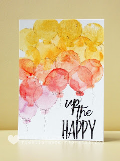
Time for card number four made with the Up the Happy set from Essentials by Ellen. This is for a challenge over at Anna K.'s blog, called CASometry. What a fabulous idea she came up with for this challenge - use one stamp set to make five cards. I'm nowhere near running out of ideas yet. We all need to do this with many sets that sit unloved in our craft rooms...


Had some fun with the technique of stamping with watercolors. After stamping my sentiment I brushed some watercolors onto the balloon stamp (TIP: Use the reverse of the outline stamp in order to get a solid image. If necessary, place a piece of foam adhesive on your acrylic block inside the outline to give more support when you are stamping the image.) and stamped away. Started with the yellow up top and moved down with reds, oranges and finally two purple balloons.

I sketched a couple strings and highlights a la Dawn E. of WPlus9. Doesn't that add a nice artsy touch? Well except for that one kinda straight line on the orange balloon. Got a little carried away with my "artsy fartsy-ness"!

I thought about adding enamel dots like Dawn did. Or a few white sequins. But in the end I settled for a few spritzers of Perfect Pearl water mix and love the result. Can you see those little glimmer particles all over, even on the sentiment? Love that stuff.


I'm  joining the AAA Cards challenge


And Stampin Royalty's One Layer Card challenge! Thanks for visiting.

Friday, June 10, 2016

prosit! - a set of wine bottle tags

Made a set of wine bottle tags for a friend who lives in our wine town. How often do we all take a bottle of wine with us when we're invited somewhere? It's pretty standard in these parts. I'm so glad I invested in the PTI Wine Bottle Tag die ;)


I chose a color palette of Pumice Stone, Dried Marigold, Bundled Sage and Scattered Straw thinking they go well with the colors of wine bottles around here - green, brown and clear with a green tint. I used - from left to right - MFT Fleur de Lis, Prima Flourish, STAMPlorations Leaf Prints and STAMPlorations Flower Burst stencils. The die cuts are from PTI Uncorked and Uncorked Words. They live at my house too ;)

I was inspired to give two techniques a try. First was from the queen of techniques, Jennifer M. It's called "faux dimension with stencils". SUCH fun and amazing results. Here's a great video.

And since I was using Papertrey product, I decided to work in MIM #252 where it's about adding shadowing to a die cut sentiment with Copics. I added a drop shadow to all of mine with a C3 gray. See it here? TIP: Choose a larger sized sentiment to make your drop shadowing easier!


I'm taking my tags to the the challenges at:
CASual Fridays - Florals (the yellow tag)
Happy Little Stampers - Anything goes with Dies

One-Layer Simplicity - Stencil Not sure if my die cut sentiments count as a layer or an embellishment. In any case, the Jennifer M. technique with a stencil is totally worth checking out!)

The yellow tag is my favorite. I think because of the stencil. Do you have a favorite?

Wednesday, June 8, 2016

gone dotty

Thanks Amy Tangerine. Saw a pic of a DIY project on your Instagram feed and my dilemma of what to create for a 1st birthday card was solved.

And thanks Mama Elephant. Found the perfect sentiment for this little Costa Rican guy in your Big Words stamp set.


Muy facil. Grabbed the SSS Lots of Dots stamp set and various fabulous Adirondack dye inks. PC-generated a "1", traced it onto post-it tape and masked my cardbase. Then stamped to my little heart's content.

When all was dry, I removed the mask and heat embossed the sentiment (the inside reads HB2U from the same ME set). Finished it off with some spritzers of Perfect Pearls/water mixture. Can't get enough of that stuff. It gives the final project such a great finish!


Thanks for looking. I'm sharing my card at:
SSS Wednesday Challenge - Mask it
Cards and More - Special Occasions
Task for Two Tuesday who's turning "1" - Party (this card is accompanying the carrot cake DD is making the birthday boy for his party)
Stempelkueche - Cards for Little Ones


Tuesday, June 7, 2016

STAMplorations inspiration #79

Welcome to the first June inspiration post from the STAMPlorations girls. I'm sharing a card I made a bit ago, lets call it the boy cousin of this card.


A squirt of blue Kesi Pschhiitt opaque spray ink onto my cardbase. A snippet cut with Little B Block Out. A red stamped then clear embossed STAMPlorations Sketched:Birthday cake and voila! I think this would do well for a masculine birthday card. Maybe for one in July now that I notice my color choices ;)

Please take a look at what the other girls created over at the blog. If you leave a comment there, you may win a GC!

I'm playing at:
CAS Mix Up - I've also got spray ink and heat embossing happening here


Seize the Birthday

Cards in Envy - where it's to be masculine and mailable
Simply Create Too - Red, White and Blue
Related Posts Plugin for WordPress, Blogger...