Saturday, September 29, 2012

reflected sentiments (MIM, PDCC, YCU)

Another fun thing to try - reflected sentiments a la Becky V. over at Papertrey's Make it Monday.  You stamp onto a piece of acetate and then use the stamped acetate to stamp the reflection on the card.

I really like the Christmas card Betsy made.  Here is my take:


Looks kinda Christmas-y doesn't it.  Have to actually READ it to get it.  I went with some text stamps from Cosmo Cricket because they had flat bottoms and didn't look totally perfect to begin with.  I feared my reflected stamping might not come out perfectly.  And it didn't.  But it's Halloween.  That's cool.

I used the color scheme from Play Date Cafe #151 to mix things up a bit too.


Notice the faint hexagons.  Trendy, eh?  Just like the gals over at Three Cool Chicks.  Day #5 was about hexagons.  Here they are.

And since this technique was totally new to me, I'm playing along with Young Crafter's Unite Challenge #14 to Learn Something New.

Thanks for your visit.


Supplies BOO:
Paper: card base Buttinette, CS Neenah & Papermania
Stamps: PTI, sentiment Cosmo Cricket
Ink: Memento, Amuse Studio
Tools: acetate
Other: 


Friday, September 28, 2012

sending fishes (Retro, YCU, SSS)


See fish.  See fish swim.  See fish heat embossed with clear powder (=shiny)  and then painted with Distress Inks used as watercolors.  Yep - a favorite technique with a new twist - after seeing Heidi V.L.'s beautiful card.  I was going to use watercolor pencils, but I only have a few standard colors.  Couldn't resist the spectrum of colors with Distress Inks...


The stamp actually did all the work.  I just colored it in.  Paintbrush.  Water.  Made me feel like an artist.  Again.  Oh the fun I'm having lately!  A sentiment on a piece of patterned vellum (cuz I couldn't bring myself to cover up too many fish) with a little strip of PP for interest.   Ta da.

Playing with the Retro Sketches Challenge #30:

And Young Crafter's Unite challenge #14 to Learn Something New:


And Simon Says Stamp, again.  Why not try to beat the odds ;)


Have a great weekend!  A special shout out to my followers.  So nice to see your smiling faces every day :)


Supplies believe in your dreams:
Paper: card base Buttinette, CS Neenah, PP scrap, vellum
Stamps: Stampout, sentiment Kaisercraft
Ink: Distress Ink, Versafine
Tools:
Other: clear embossing powder

Thursday, September 27, 2012

wa shi doin? (Three Cool Chicks, SSS)

Yeah, what AM I doing?  This is so much fun.  Be crazy.  Think outside the box.  Join in.

I'm playing with Three Cool Chicks this Trendy 2 week and one topic is WASHI.  (How could you have a "trendy" week without washi, eh?)  Another is STENCILS.  Read:  achieving the effect even without a stencil...

This was one of those cards that materialized out of some crannies of my noggin.  No clue.  Just the creative process at work, I guess.  Start with a piece of cardstock.  Lay some strips (the ones you'd usually throw away after trimming) in a haphazard pattern.  Give a couple squirts of yummy Dylusions spray ink.


Remove the strips and give it one squirt of Bubblegum Dylusions.  Oh how cool.  I really feel like an artist when this happens!


Attach washi tails to paper clips, put the paper clips onto a die cut circle - notice that adorable KITSCHY PP I got at Aldi - and attach that to the card.


Glue panel to card base.  I put a little strip of tape along the bottom edge of my card.  BTW this is actually cello tape with a pattern.  It's shiny but still transparent.  Permanent when you put it on the paper.

I stamped my sentiment and attached it with some more washi.  Figured this would be a fun thank you card since the recipient would get some fun paper clips to keep.

Never ever would have come up with this on my own.  Thanks Three Cool Chicks, especially Julie T.W.
Joining the masses over at Simon Says Stamp's "Anything Goes" challenge cuz this definitely fits the ticket.  Those ladies are so nice.  They make it around the hundreds (thousands?) of entries they get and leave comments.  Then again, with a whopper prize like that, you're askin' for it ;)

Thanks for looking.


Supplies thanks:
Paper: card base Buttinette, CS Neenah, PP Bringmann
Stamps: sentiment Jane's Doodles
Ink:Dylusions ink spray, Adirondack
Tools: die MFT, corner rounder EKS
Other: paper clips, washi


Wednesday, September 26, 2012

wine. tag. (ABNH, Hero Arts)

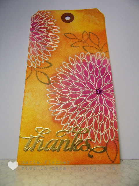
Quick one here just under the wire.  Need a tag to go on a bottle of wine.  Here it is.


Some faves here.  Heat embossing.  Distress Inking.  Splattering with water.

Played with these ladies:


Thanks for looking.


Supplies tag:
Paper:shipping tag
Stamps: Hero Arts, PTI, sentiment WMS
Ink: Versamark, Distress Ink
Tools:
Other: bling, ribbon, embossing powder

Tuesday, September 25, 2012

what's the opposite of hoarding? (Three Cool Chicks, PTI)


So is it dehoarding?  Or unhoarding?  Using up my hoard.  Whatever.

What a cool theme for a blog hop over at PTI.  "Felt and Fabric Wrap."  How cozy does that sound?  And do you know the Three Cool Chicks who are getting trendy this week?  These ladies rock.  And they are brave souls who admitted that they're hoarders.  (I usually wimp out and say I "recycle...")


Anyhoo, friend's birthday is coming up Friday.  Got her a Brothers Grimm book (whole nother story) - so figured it was time to give it a wrap.

I am thrilled to present:


Cuz I love me some polka dots.  And lots of "recycling".  Where, you ask?  Packing paper, lace curtain flower layer, wall tatoo flower stems, cookie packaging corrugated white cardboard die cuts.   And for me nothing is more signature PTI than those little die cuts...  They were part of my first PTI order this summer.

New items include the fabric (which my friend will certainly use again cuz she's good like that ;), felt and buttons.  And technically the red yarn, although I've had that for a bazillion years.

Thanks for hopping by.  Looking forward to seeing what you wrapped up.


Supplies gift wrap:
Paper: recycled packing paper, cardboard, wall tatoo
Stamps: 
Ink:
Tools:dies PTI
Other: fabric,  yarn, felt & buttons Sew Sweet


Monday, September 24, 2012

soft and lovely (CPT, I am Doe, Jay Gee's Nook)

Another quick post to show you a card I made based on the sketch/image over at I am Doe.  Couldn't get this out of my mind.  So many elements I love.  The softness, the typography, the squares and washi.


I used the colors from the color challenge at Creative Paper Trade cuz this photo is just so lovely.  And I used a bit of my scraps from this card I made using a digi notecard from CPT.


And the inspiration board from JayGee's Nook (those pastel "nail polish" dots) has stuck in my head since I first saw it.


Here's my card.  One layer and lovely.


Know how I achieved that soft and lovely look?  Stamping off before stamping the images on the card.  And then I gave the entire card a light layer of white acrylic paint.  Ta da.  Applied the circle and washi over that.

I'm parking this over at Simon Says Stamp's blog because I'm in love with this little stamp set from American Crafts.

Thanks for looking.


Supplies thanks so much:
Paper: card base Papermania, digi paper Creative Paper Trade
Stamps: American Crafts, triple square and bracket sentiment Hero ARts
Ink:Jenny Bowlin, Versafine
Tools: punch EKS
Other: washi Rayher., acrylic paint

more fun on the first day of fall (LIM)

Got a new stamp.  Well, not just one.  Let me tell you it is worth its weight in gold.  Well, not really.  And it was a super pain to peel off the acetate sheet it came on... but that's a whole nother story.

Viva Decor.  A German company I believe.  Not expensive.  And they're hyping this model as "3D", which was the road I ventured down at first.  But you will not be seeing that card here.  Not now at least.  Cuz I found a much better way to use it.  IMO at least.

Check this.


I was just playing actually.  Stamping off onto the envelope of that card you aren't seeing here.  And I stumbled into this rose.  And when I turned the envelope I thought, "hey, I like that even better."   The rock-n-roll technique, recognize it?   Then I leafed through some other recent purchases (which are still not put away) and this Ali Edwards sentiment just seemed made for this image.

Like I said, IMO.

Less is More has a cool "Recipe" challenge.  You pick three of their past challenges.  I must admit I backed into this one, but hey.  One layer flower or tree.  Check.  Three stamps.  Check. (I combined two sentiment stamps.)  Off center.  Definitely.

Hope you like these colors cuz you'll be seeing them again.  Thanks for looking.


Supplies so sorry for your loss:
Paper: card base Papermania
Stamps: Viva Decor, sentiment Technique Tuesday
Ink: Distress Ink, Versafine
Tools: 
Other:


Sunday, September 23, 2012

fun on the first day of fall (PDCC, CFC, Moxie Fab, SSS)

I love stamping.  And inky fingers.  I had so much fun today, with both.  DH was watching some marathon soccer so I disappeared to my creating space (read: laundry room!)

Fall fun.  That's this week's theme at CASual Fridays.  I have fun every time I pull out Teeny Trees from Waltzingmouse.

And I decided I could accentuate the "fun" aspect by going with The Play Date Cafe's color scheme of Flamingo, Honey and Coffee.  In translation:  Worn Lipstick, Wild Honey and Vintage Photo Distress Inks (how I LOVE playing with those inks!)


 Pretty simple.  I just love those trees.  Give 'em a two-tone look and they are so gorgeous.  Was going to add twine originally, but when I grounded them with the sentiment I couldn't bring myself to add anything else to the card except a little heat embossed birdie.  Gave it just a two-edge mat - asymmetry, ya know?  (Thanks again for the lessons on design, Moxie Fab.)

Liked it so much I turned around and made two more.  For aunts and uncles.  Shhh... don't tell 'em.

Playing at:


and Simon Says Stamp:  Emboss It!


Supplies Happy Thanksgiving:
Paper: card base Papermania, kraft
Stamps: WMS
Ink: Distress Ink
Tools: 
Other: clear embossing powder

Saturday, September 22, 2012

pretty pastel (CPT, Artful Delight)

Doubling up on the challenges for another card.    New to me, the sketch challenge at Artful Delight.  And the color challenge at Creative Paper Trade.


Worked with one of the digital papers -actually a notecard I turned into a  frame - which I was lucky enough to win during Creative Paper Trade's introductory week.  Just love Andrea B.'s combo of pastel colors with modern designs.  Worked with my new Amuse Studio pigment inks in those wonderful hues.  So wonderful you can barely see 'em, eh?

Taking the sketch from Artful Delights pretty darn literally, I opted for a tree (stamping with Teeny Trees from WMS).  For the leaves I used a "you" stamp, also from WMS cuz I wanted to play off the typography challenge also at The Creative Paper Trade this week.

Embellished with one of my homemade chipboard pieces and some washi.  A touch of Distress Spun Sugar around the edges and voila.

Happy Saturday ya'll.


Supplies Happy Birthday:
Paper: card base Papermania, digi paper Creative Paper Trade
Stamps: WMS, sentiment Hero ARts
Ink: Amuse Studio, Distress Ink
Tools: die PTI, punch EKS
Other: washi Bella Blvd., acrylic paint

Friday, September 21, 2012

masculine card helps law of averages (Retro)

OK, so I complained about the many detours I took on this card.  But when I got the idea to make another one using this Retro Sketches sketch and a 6x6 PP pad, the average time per card got knocked back down into the realm of acceptable!

So here's another entry for this sketch and this one is so CAS and so masculine.  I'm a happy camper.


My choice of PP as well as the random lettering was inspired by the Paper Nudge over at The Creative Paper Trade.  Another new blog with great challenges and beautiful products to win.


Happy weekend everyone.


Supplies Happy Birthday:
Paper: card base Buttinette, PP Basic Grey
Stamps: alpha Fancy Pants, sentiment The Craft's Meow
Ink: Versacolor, Versafine
Tools: punch EKS
Other: letter stickers Making Memories


Thursday, September 20, 2012

washi misted veneer windows (Retro, I am Doe, Moxie Fab)


This was another of those journey cards.  Many detours.  What it came down to was a new mask and a new Glimmer Mist (Puerto Rico = periwinkle if you remember the Crayola box of 64) which still hadn't been put away properly.

And these two challenges.  The sketch over at Retro Sketches.

And this "sketch" over at I am Doe.  You may have heard of Freckled Fawn.  They have the cutest product pictures, always staged with an adorable fawn statue.  There is now a challenge at the blog.  And who wouldn't love to own some more of the adorable washi tape they carry?


I did myself no favor by combining the two challenges.  They have little to nothing in common.  But then I looked at the layout from I am Doe and reduced it to the elements that caught my attention.  And those were:  washi tape, typology, blue and pink and everything very soft and fuzzy as if in a fog.


Thus the misted image.  The vellum windows with the blue and pink birdies underneath.  The distressed typewriter sentiment.  And the washi.  Of course.

TIP:  Be aware if you apply Distress Ink to wood veneer shapes, they turn out A LOT darker than the original ink color.  That veneer birdie is supposed to be Shaded Lilac which was actually a pretty good match for the Puerto Rico Glimmer Mist.  Maybe I shoulda misted Mr. Bird.  Hmmm.

Adding this to the list over at Moxie Fab's Gallon, Quart, Pint challenge cuz I consciously made the decision to overdo the blue and then add the yellow and pink proportionately.

Thanks for visiting.


Supplies Happy Birthday:
Paper: card base Buttinette, CS Neenah, recycled vellum
Stamps: birds Artemion, sentiment The Craft's Meow, template Crafters Workshop
Ink: Distress Ink, Aladine, Glimmer Mist
Tools: punch and corner rounder EKS
Other: veneer Studio Calico, washi Bella Blvd.

Wednesday, September 19, 2012

another jar of joy (Moxie Fab, HA, ABNH)


Mason jars, beach glass, the St. Clair River.  I just love that hue of blue.  Knew there was another mason jar to come after this one.  I "blued up" a whole sheet of acetate when I was playing with alcohol inks.  Have to use it up!

This time it's a card.


Cut a jar from a sheet of PP and stamped some Jenny Bowlin red Hero Arts flowers on it.  Tied twine around the bottle neck and added scraps of lace and gingham to the bow.  Doesn't gingham just make you happy?  Masked a circle on the kraft (using the negative die cut) and stamped a lacy BG with white pigment ink.   Using the positive over the white circle, I stamped a shabby polka dot pattern using Versamark.  Added messy stitching just to the corners.

Used a HA Christmas sentiment selectively inked ("a gift for") and finished it off with a HA "U" stamped onto white paper behind the inked blue acetate in the little tag.  Up to this month's HA challenge of stretching those stamps - used a holiday stamp for a non-holiday card.

Added a couple borders and pearls, a la the lovely Colleen D., who is guesting over at Do More with Less.  Check out the challenge to create a shabby, chic card.

Also heading this over to Moxie Fab's Jars of Joy challenge in case Cath hasn't seen enough cards lately ;)  And to A Blog Named Hero "Tag It" cuz there's a teensy metal-rimmed tag on it.


Supplies a gift for U:
Paper: card base Buttinette, kraft, PP American Crafts, vintage book
Stamps: BG CHF, flowers /sentiment/alpha Hero Arts
Ink: Jenny Bowlin, pigment Adirondack, Versamark,Versafine
Tools: dies PTI, Amuse, sewing machine
Other: metal frame, lace, twine, fabric, pearls

Tuesday, September 18, 2012

happy boo day (PS, DYSU)


Take the colored-pencil-on-kraft technique.  Apply the colors from the Paper Smooches Sparks Challenge "Cool Shades" and add a bit of twine (they are looking for kraft + twine over at DYSU).


This is what happens when I do all of the above.


Add a teensy spider - cuz she's just so darn cute - some twinkly stars in the sky and a mint green button and a couple mint green exclamation points.  Then some pearly polka dots for the ghouls and voila.

Not really sure if I would send this off as a Halloween card, I kept my options open by stamping a sentiment on the inside which I would also use for a punny bday.  Used the rock-n-roll technique on the "2" and just love how it turned out.


Thanks for looking.


Supplies boo! you:
Paper: cardbase Buttinette, kraft
Stamps: Paper Smooches (except "day" and "2")
Ink: white pigment Adirondack, Versamark
Tools:
Other: colored pencils, twine, button, pearl marker

midnight feast amongst tiny trees (WMS)

Nearly missed this one (something's up with my reader) but I'm playing along with the Waltzingmouse blog party with the theme "Fall".

My mind went to Tiny Trees and great fall colors.  But then I thought that was too easy.  Then I saw the sketch and decided to go with silhouettes in a group of four.  Then it dawned on me.  Halloween silhouettes and Halloweeny colors.


Stamped some watercolor-y squares using the back of an inchie stamp and Distress and Adirondack inks misted with Perfect Pearls water.  You can see the cool sheen a bit on this close up.


Stamped the bat and cut the images using a circle die cut.  Cuz I felt like using circles.  And I don't have square dies.  That made the selection of PP pretty easy when I saw this dot pattern in a My Mind's Eye Halloween pack I have.  Decided to add some heat embossed teeny trees and bats in the background and put the sentiment (Happy Halloween) on the inside.

First Halloween card of the season for me.  Thanks for looking.


Supplies :
Paper: cardbase Buttinette, PP My Mind's Eye
Stamps: Waltzingmouse
Ink: Adirondack, Distress, Versafine, Versamark
Tools: dies MFT
Other: embossing powder


i like neon! repeat (SSS, Moxie Fab)

Neon's gotta hold of me now.  And I had scraps.


 Not much to say here.  Scraps from this card.  Embossing plates.  Heart punch.  New Kaisercraft stamp which was "not expensive" but squishes a little too much when you put too much pressure on it (notice the stray embossing powder stuck to the squished Versamark.  Oops.  Couldn't clean it up without taking off half the "be".)

Adding this to the bunch over at Simon Says Stamp's challenge to be trendy and the Moxie Fab challenge "Repitition."  I'm tryin'.


Supplies be yourself:
Paper:Papermania
Stamps: Kaisercraft
Ink: Versamark, highlighters
Tools: embossing plates Sizzix, heart punch The Paper Studio, corner rounder EKS
Other: embossing powder Zing


Monday, September 17, 2012

neon is a color, right? (CFC, SSS, The Stamp Man)

Short and sweet.  Bright and not 100% right.


As in, if I would have read the instructions better...

Saw the challenge at CASual Fridays and as it was churning over in my cabeza I thought it was to use black/white/pop of color.  With all the neon going on out there right now, my pop of color became neon.  Not owning neon supplies I grabbed DD's highlighters.  (Anyone else out there remember when highlighters were available in yellow or yellow???)  I cased myself for my card design, just gave it a bit of "Modern Basics" edge.


Quite fun and mod, methinks.  Like those embossing motifs?  Picked up some oldtimer embossing plates from Sizzix (in their online outlet... schlepped them back in the suitcase this summer too...) and really like what they produce.

Anyhoo, the CASual Fridays gals are looking for "B/W and one color".  Oh well.  Neon is a color, right?

Simon Says Stamp is looking for "Trendy" cards and The Stamping Man is looking for cards using "Hot Colors" in reverance to summer.  Play along.
And have a Happy Monday.


Supplies happy birthday: 
Paper: Papermania
Stamps: PTI
Ink: highlighters, black Versafine
Tools: embossing plates Sizzix, corner rounder and square punch EKS
Other:

Related Posts Plugin for WordPress, Blogger...