Friday, August 29, 2014

simply create too 69 (something new)


Challenge #69 has begun at Simply Create Too and it's titled "Show Us Something New". Now, my new schtuff is coming back with me when I return from the US, but I'm sharing a card I made with a new twist on an old technique. Remember string art?

Note: After I had made the aforementioned card, DD made me a string art work of art for Mother's Day. She painted a piece of plywood cream, put the nails into it and threaded the heart with red thread. Love it. 

So, that probably inspired me ...


Get it? I probably either should have stopped at about two feet less thread or used a darker red CS for the die cut "you" so that it would be more visible, but I still like the idea of "have you in my heart" that this technique enables.

I pierced holes around the edge of a heart die and then randomly stitched around and across the heart. I adhered the "you" halfway through the process and then the strip of washi at the bottom of the panel. Adhered the panel to the cardbase and voila!

Thanks for looking.


Supplies for you in my heart:
Paper:  CS Bringmann, PP Studio Calico
Stamps: 
Ink : 
Tools: heart die Sizzix, you die Simon Says Stamp
Other: thread, washi Freckled Fawn

Monday, August 25, 2014

change it up - yellow ribbon

Welcome to installment #3 of "change it up". Showing you how cards can be morphed (can you say that?). Meet specimen #3.


Can you guess what the submission call category was for this card? Think Tony Orlando. Dating myself, eh? Needless to say I wanted the focus to be on the yellow ribbon tied around the old oak tree, so I kept the rest of the card very simple.

Now, I guess I could have sent this to OWH, but when a submission call for Using Texture Mediums came along, I chopped it down and made this.


Now I wish I could see a photo of what it looked like chopped into the wonky rectangle shape and un-watercolored. I'm thinking that might have looked better given the humongous heart I put on the card! If I recall correctly the heart was to hide the boo boo left behind when I removed the yellow ribbon.

Anyhoo, although it's tiny and sweet and personal now, I think the sky looks kinda ominous. Oh well, live and learn.

Hope you're enjoying blue sky and sunshine wherever you are today. (Hope I am too ;) Thanks for visiting.


Supplies for just for you:
Paper:  CS Bringmann, Amuse
Stamps: PTI
Ink : Distress Ink, Memento
Tools: tree die PTI, heart die Amuse, wonky rectangle die Spellbinders
Other: embossing paste


Friday, August 22, 2014

change it up - king of the grill

Welcome back to "change it up" where I am sharing some reworking of cards to try to make them better. Here is specimen #2.

Started out as an entry for a submission call for PCS Cards for Him. For the outdoorsy kinda guy.


Thought I was being quite clever using the utensils from the Jane's Doodles stamp set It's a Guy Thing to create the grass for the grill to stand on and then the blue sky with the sentiment. The banner sentiment sticker up top, so-so. The touch of striped PP under it definitely helped. But not accepted for publication.  I later did this with the card...


morphing it into a Father's Day card. Added Glossy Accents to the grill (definite improvement) and a sentiment made from alpha stickers. More stripes down the left edge along with a strip of green to tie in with the "grass". But not a show-stopper.

I still like the first one better, I think. How about you?

BTW, I've scheduled these posts in advance. As you are reading this, I am probably hanging around outside Comerica Park where DS is at the Eminem concert with a cousin. And I can't wait to see what I will have learned from that experience!


Supplies for king of the grill:
Paper:  CS Bringmann, PP Simple Stories
Stamps: Jane's Doodles
Ink : Jenny Bowlin, Versafine
Tools: 
Other: alpha stickers Bo Bunny, Glossy Accents


Wednesday, August 20, 2014

simply create too 68

It's "Monochromatic Madness" time over at Simply Create Too and I've got a monochromatic card to share with you. No "change up" here, but it's of the variety reject too ;)


I think this is a great design for a masculine or teen birthday card. And it's pretty easy to create too. Use a line stamp (or a strip of craft foam like I did) and ink or watercolors (like I did) and stamp the stripes. Put down a piece of double sided tape and add glitter to it for some punch. Add a large sentiment - mine is from Clear and Simple Little Critters Too - to match the tone of your card and voila!

Make it feminine with pretty soft colors (pinks and peaches) and an elegant font sentiment. Or bold with neon yellow, one strip of black and a big bold sentiment.

I'm joining the Simon Says Stamp Work it Wednesday gang with this "blue" card.

Join us over at Simply Create Too with your monochromatic beauty!


Supplies for happy birthday:
Paper:  CS Bringmann
Stamps: sentiment Clear and Simple
Ink : Versafine, watercolors
Tools: 
Other: craft foam, Score Tape, glitter

Monday, August 18, 2014

STAMPlorations sketch #18


How do you like this sketch? It's the newest one at STAMPlorations. Probably a whole lotta room for interpretation there, but I went pretty literal again. Made a masculine card in contrast to this one a couple weeks ago.


Just asked DH - looking over my shoulder - if this reminds him of the beach. He responded "more like steamy windows". What am I to make of that??? Guess that's OK for a guy card, too, eh?!

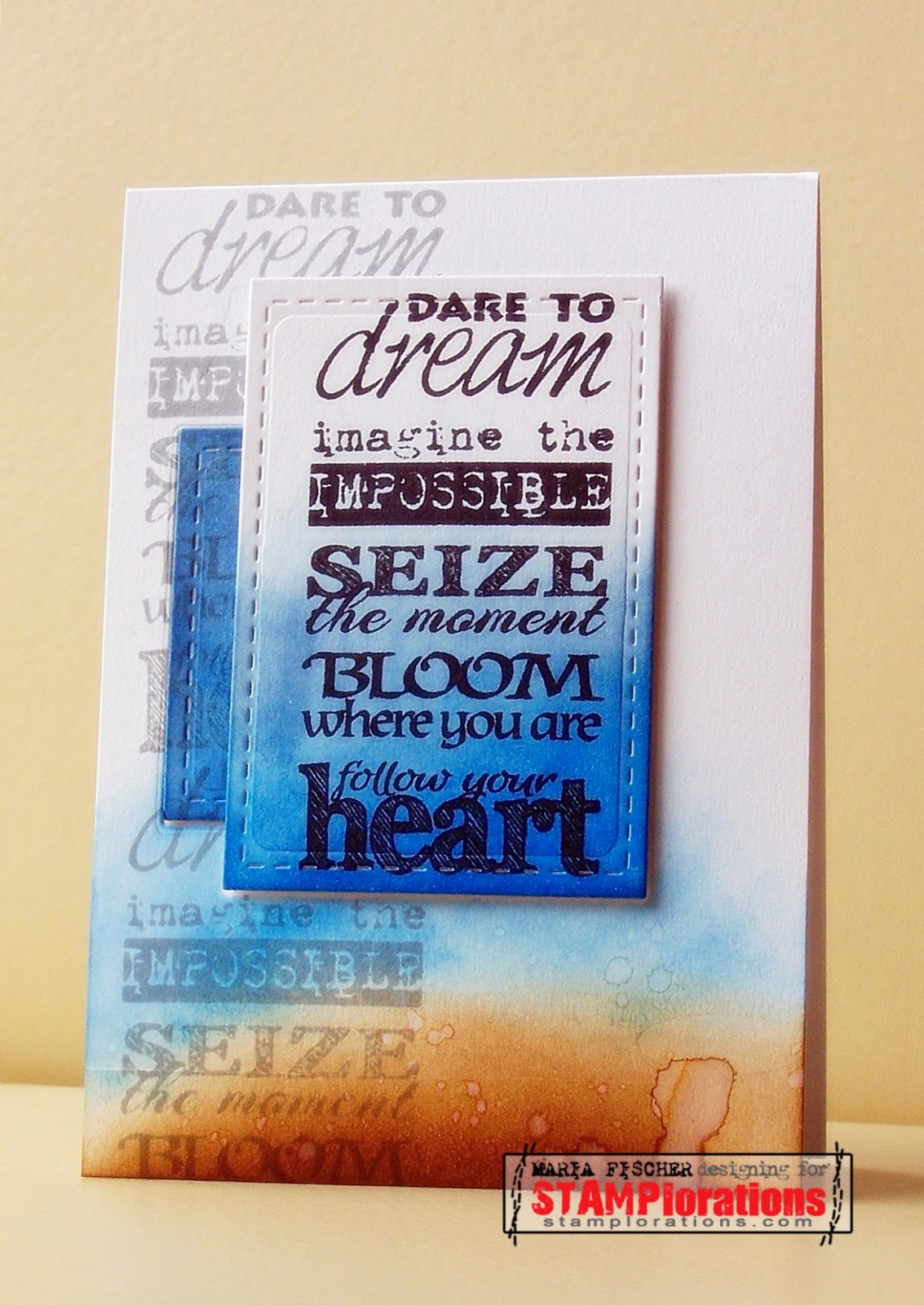
Anyhoo, I stamped the strip of sentiments from SUBWAY ART BUILDERS: Dare down the left side with Hero Arts Soft Granite and then die cut the smaller rectangle from the card front. Inked it up with Faded Jeans and Salty Ocean. Die cut the larger rectangle and stamped the sentiment in black. Then I partially distress inked the front panel with Gathered Twigs and Salty Ocean. Splattered some water onto my "beach" scene.

Adhered CS on the inside of the card front and adhered the smaller rectangle with foam adhesive. Adhered the larger rectangle with doubled foam adhesive and voila!

Check out the fun takes on the sketch from the DT and our oh-so-lovely guest designer, Carol, of Just me: c fame and give it a go. If you are chosen as the winner of the sketch challenge you may pick three digital products from All About Scrapping. And you'll be a guest designer in next month's challenge!


Supplies for follow your heart:
Paper:  CS Bringmann
Stamps: STAMPlorations
Ink : Distress, Hero Arts
Tools: stitched rectangle die Lil Inker Designs
Other: water


Saturday, August 16, 2014

change it up - lure the best

Howdy. Some extra special vacation programming coming your way. Last year I treated you to a parade of rejects. This year I'm going to show you how I changed up some so-so cards to turn them into something publication-worthy. Didn't work, but such is life ;)

Here's the first one. Made this for a submission call for the categories ombre and watercolor.


One of the best-designed stamp sets out there, if you ask me. Fish More from WPlus9. It pretty much works on its own, but I gave it an ombre-stamped-with-watercolors-on-a-strip-of-craft-foam ocean to work with. And a silver heat embossed edge. Na ja. Missing something.


So I gave it a watercolored sunshine (which looks more like Jupiter) to fill up the empty sky and make it a happier card. And sent it to Dad.

Hope you enjoyed.


Supplies for lure the best:
Paper:  CS Bringmann, navy PP Basic Grey
Stamps: WPlus9
Ink : Jenny Bowlin, watercolors
Tools: die WPlus9
Other: 

Wednesday, August 13, 2014

so what does it say?

So do we finally know what the fox says? Who cares, right?

You may remember I used a leftover tidbit on this card which I told you was from a fox card that wasn't selected for publication. Well here it is for you.


I had decided that the square-ish speech bubble worked better here, so the round one was left lying on my desk and caught my eye for that "vintage" card.

For this card I used digi PPs from Melstampz and a fox image from meinlilapark. Notice I fussy cut the fox leaving some white behind him to mimic snow drifts. PC generated the lunch sentiment. Toughest part was aligning the die cut alphas!

Hope you enjoyed.


Supplies for what do you say:
Paper:  CS Bringmann, digi PP melstampz, fox meinlilapark
Stamps: 
Ink : 
Tools: dies PTI
Other: 

Friday, August 8, 2014

STAMPlorations august challenge "stamps and die cuts"


Isn't that a great challenge? It's the August challenge over at STAMPlorations. Stamps AND die cuts. I love both. Still find it hard to believe I used to think I could survive without a die cutting machine. "If I want a shape bad enough, I can just cut it out." Ha!

Here's what I did. As you may recall, I love me some art deco. I purchased the PTI die awhile back and decided to pair it up with the STAMPlorations Art Deco Border Builders stamp set.


Die cut the frame and adhered two portions of it to black CS. Stamped the border builders element in Hero Arts Soft Granite and then heat embossed a sentiment from PTI onto vellum so that the border could still be seen behind it.

So what will you do with stamps and die cuts? So many possibilities. Check out what the DT and our incredibly talented, watercolor-wonder-working guest designer, Karen D., created for August's challenge and then join us.

There are loads of prizes to be had. The winner of the monthly challenge receives a STAMPlorations set of choice (two if STAMPlorations stamps were used on the card). And a random winner who plays in all three challenges in August could win an extra prize. Join us.


Supplies for thank you:
Paper:  CS Bringmann, texture CS American Crafts, vellum
Stamps: STAMPlorations, sentiment PTI
Ink : Hero Arts, Versmark
Tools: dies PTI square die Sizzix
Other: gems


Monday, August 4, 2014

STAMPlorations sketch #17


That's it - the new sketch up at STAMPlorations. Kinda fun, eh? I went literal. Literally.


Tried to keep it masculine. Used a sentiment from VIGNETTE: Celebrate Artsy and stamped it on PP. Love when I remember to do that! Even inked the edges a bit. Cuz I was in an inky mood. See those squares behind the stamped square - they're inked too to achieve the same colors as on my image panel! And that is a stamp from VIGNETTE: It's Your Day which I inked up with three different ink colors before stamping.

Check out the lovely cards from the design team and our guest designer, Kim M., of Art Keeps Me Sane fame. And remember that if you join all three of our challenges this month - two sketch challenges and the monthly challenge which is themed "Stamps and Die Cuts" - you're in the running for a great prize too.

Join us, won't you? The doors are open until August 15. Thanks for stopping by today. It'll be a bit quieter around here for the next few weeks. Vacay calls!


Supplies for hb2u:
Paper:  CS Bringmann, PP Basic Grey
Stamps: STAMPlorations
Ink : Colorbox
Tools: square  dies Sizzix
Other: 


Friday, August 1, 2014

Mixed Media Card Challenge #2


It's time for the second challenge at Mixed Media Card Challenge and this month it's about "Summer" with an optional element of "burlap."


A little reminder - at this challenge it's about a card, using stamps and ink, and including some texture, dimension and/or technique.

Oh, and I hope you're with me on this when we pretend a peony is a summer flower ;) Here's what I did.


Got the stamps and ink thing going on the peony - it's heat embossed white and then watercolored (there's a technique for ya, too) with Distress Inks. Time consuming but therapeutic ;) Got the texture with the gold metallic embossing paste BG, the stickles stamen and the burlap. Got the dimension with the peony raised on foam adhesive and the Dymo sentiment. Nothing CAS about this one, but I think it's so wonderfully decadent!

If you're interested, I created a similar version of this card awhile back. This one definitely has more oomph. And more texture.

I hope you'll give mixed media a go. Join us with your summery creation.  And thanks for stopping by.

Supplies for celebrate:
Paper: Bringmann, watercolor (Target for kids)
Stamps: Stampendous
Ink : Distress Ink, Versamark
Tools: stencil Prima, scissors, dymo labelmaker
Other: gold embossing paste, white embossing powder, paintbrush, burlap


simply create too 67 (old/vintage)


Challenge #67 is up at Simply Create Too and I know it's one that will find lots of takers. The theme is "Old or Vintage". What do you think of when you hear that? Some things that go through my mind are old photos, scrunched seam binding, vintage photo ink, lace trim, pearls. Hmmm...

I grabbed a script BG stamp and a vintage looking lady along with a wine label (thanks, Jacqueline!)and this is what happened.


Went with Tea Dye for the smaller panel and stamped the lady in Hero Arts Soft Granite. Stamped a doily and a branch (die cut from craft foam) and took the ink pad directly to the cardbase a couple times too.

I added some seam binding and a button and the die cut wine label on top of the card and then had to give the whole thing an "edge" by adding the speech bubble sentiment which was a leftover from another project. Actually, it was a fox project and since the animal trend seems to have moved on and left the fox behind,  I'll be back to share that with you soon ;)

Feel like giving "Vintage" a go? I'd love to see where the theme takes you. Have some fun and simply create, too!


Supplies for let's do lunch:
Paper:  CS Bringmann, PP Melstampz, wine label
Stamps: BG Stamping Bella, lady Paper Artsy, doily Viva
Ink : Distress, Hero Arts
Tools: branch die Kesi Art, speech bubble Avery Elle
Other: seam binding, button


Related Posts Plugin for WordPress, Blogger...