Warning: lengthy post. But there may be some tidbits of information you'll be glad you stuck around for...
Hero Arts stamp designers, CAS, amuse studio inks, card design just to name a few...
It all started with the August challenge at
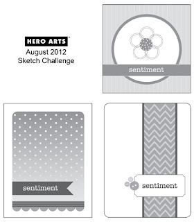
Hero Arts. Had to have a go at this one - CAS and stamping. I'm in my glory! So I chose the lower right sketch and perused my HA stamps.
Now, when I look at those sketches my mind's eye sees layers. Layers? I'm trying to get away from clutter! But when I saw this mini stamp set in my stash,
my problems were solved. The HA stamp designers did my work for me. Thanks folks. Maybe I should mention here that I had already reduced the sketch to its basic elements - a strip down the edge and a sentiment breaking it up. CAS, ya see? I trimmed one piece of CS into 3 cards and decided to have some fun.
I purposely chose the textured CS to give the mega white space some interest. Decided to see how dye inks paired with clear stamps would work. I'm completely satisfied. The red is Jenny Bowlin, the rest Adirondack. I think I've mentioned before, HA stamps and Versafine nearly always work perfectly together for sentiments. Needed one more card to finish up the bundle for my friend's bday present.
This guy card used another HA set, Mix & Match Elements. Only decision on my part - which stamp and which color combo to use. These colors are all Distress Inks. Sentiment Versafine gray. I like the effect of stamping over the woodgrain with the frame to tie in with the sentiment box.
So hold that thought.
There's also a cool inspiration at
Paper Smooches Sparks Challenge - Picture Perfect.

Hadn't played here for a long time and I'd love to win me some of the newer graphic stamps Kim has designed ;) Well, I was all about that lower portion of the sofa. Would give me a chance to try out my new Amuse inks since I got two browns and two greens. And as I was perusing my few PS stamps and stumbled upon this sentiment, I decided to mix things up a bit and create a new baby card. Unexpected, eh? There is beauty in the unexpected. Don't know if any great philosopher ever said that, but he/she should have.

Colors were totally from the inspiration. Chose the polka dot stamp this time cuz hey, it's a baby card. And my new Amuse inks. BTW, they too flew over the pond in my suitcase! So here you see the result of Amuse + clear stamp + textured CS. Since it's pigment ink it's stickier than dye ink and therefore it really sticks to the stamp where there are crevasses in the CS. I guess the dye ink is more watery so it kind of slides off the stamp and down into the crevasses. Make sense? So, I'm OK with this result but if you're up for perfect coverage, keep this tidbit in mind. (You probably already knew this anyway...)
Stop here if I've bored you. But I do have one design issue to share. Check these two photos.
Notice the button. Guess the first question is, why did I decide I needed a button on this card and not the others. Don't know. But then the question was, where should it go? The first photo shows my automatic assumption. But then I got a feeling that it didn't belong there. I felt there was too much empty space in that box housing "baby", and putting the button on the left would make the whole card fall over to the left. Making any sense? So it got strategically placed where it now sits. Can anyone (like with a degree in design) explain this to me? Or am I off my rocker?
Over at the new challenge blog
CASology, they list one quality of CAS as "easy to recreate." Perhaps I've motivated you to recreate.
I'm done.
Supplies:
Paper: CS American Crafts
Stamps: HA, welcome baby Paper Smooches
Ink: Adirondack, Jenny Bowlin, Distress Ink, Amuse, Versafine
Tools:
Other: button


-3.jpg)


