Thursday, February 27, 2014

pasty and pearly it is (SSS, PTI)

I'm so excited.  My friend asked me to make the invitations for her daughters' confirmation. (These are the gals I had come over for some post-WCMD cardmaking!)  She picked a card of mine that she liked and asked for pinks and purples with silver instead so I got to it.

This was numero uno.


Structure paste applied through a stencil. Stamped squares along the bottom and die cut letters on a vellum strip. But then I thought about heat embossing a  feather stamp with silver powder.  So along came numero dos.


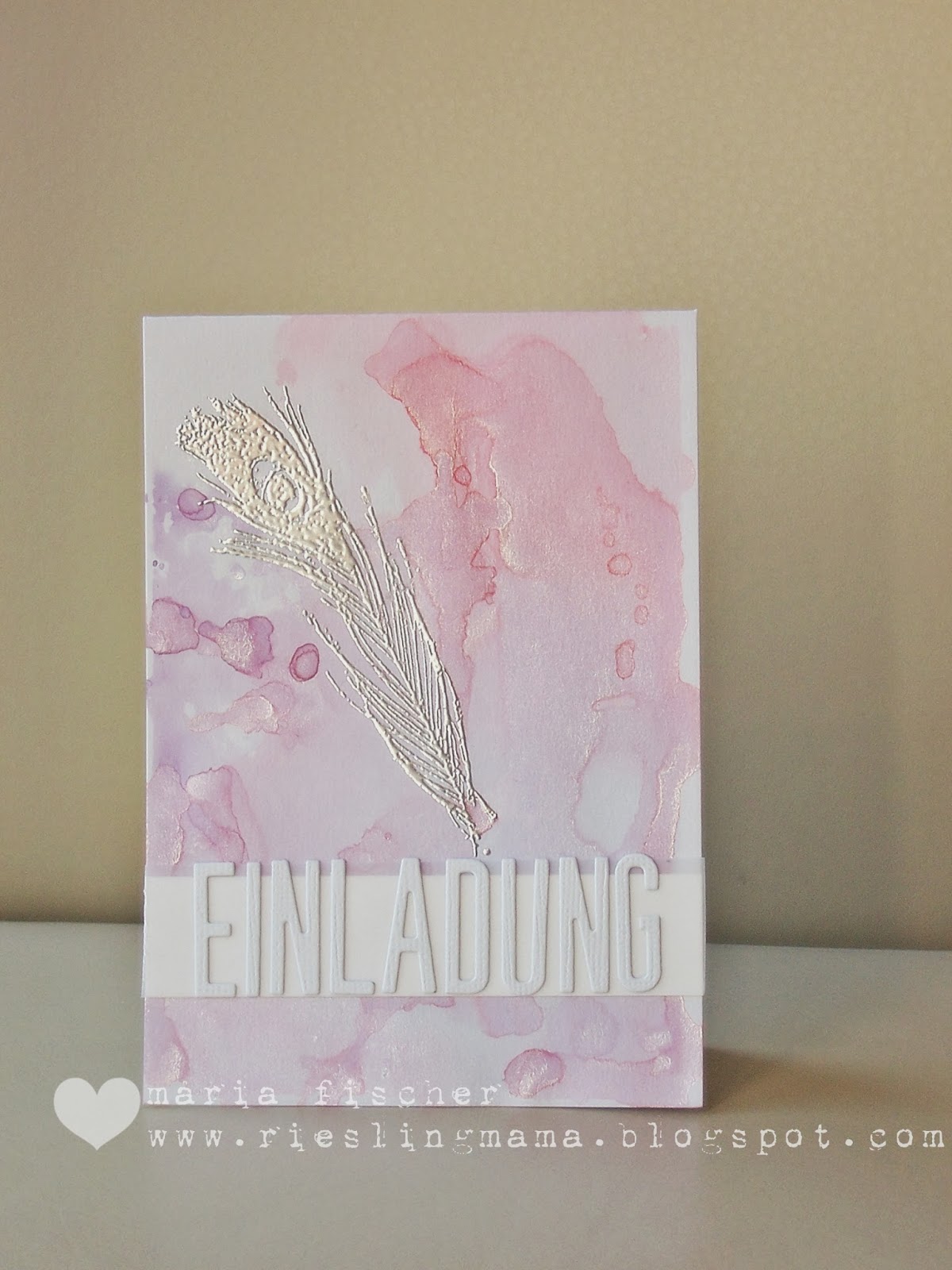
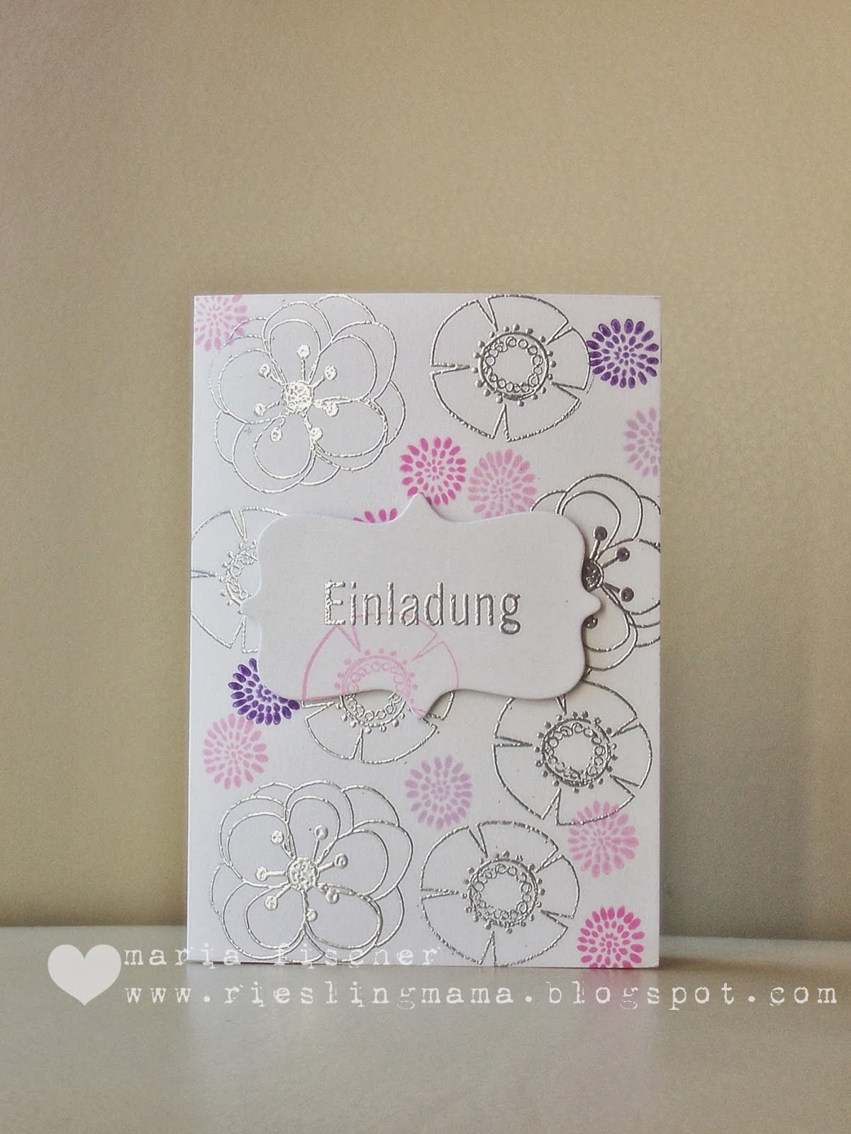
Created a watercolor background using Distress Inks on a craft sheet spritzed with lots of Perfect Pearl water. And then, wondering what feathers have to do with confirmation, I decided to give her a more traditional option, numero tres.


I'd love to know which you would pick.

I'm joining these challenges:
Simon Says Monday Challenge - Paste with numero uno
Simon Says Wednesday Challenge - Pearls with numero dos
Papertrey Make it Monday - #153 with numero dos

Thanks for looking.  Happy almost weekend.  And to my German friends... wolle wir se reinlasse?!?!?

Friday, February 21, 2014

1,2,3... smile (STAMPlorations, ABNH)

So many roads lead to Rome... How do you like to achieve the oh-so-trendy watercolor look?  With good old-fashioned watercolors?  With stamps that look like brushstrokes? With patterned paper that looks watercolored? With mists? Dye inks used like watercolors?

I love the technique of applying Distress Ink to an acrylic block, misting it and then smooshing the block onto CS.  Like on my hello card in this post. There's always that one nice blob of water that leaves one nice blotch.  My artsy fartsy crafty heart just loves that.


So my heart, which also loves rainbows in any form, put down a few acrylic blocks of misted Distress Inks, stamped over them with a camera image from Amy Tangerine's Aspire stamp set and stitched on some teensy alpha stickers from KI Memories.

Stamping? check. Stitching? check. That's the theme of February's challenge at STAMPlorations:


Join us for the fun - you have all month.  While you're there, check out the bi-weekly sketch challenge too. Shery is so generous with her prizes.  Play along.

I'm playing at A Blog Named Hero too.  #38 is all about ROYGBIV.  Love that guy ;)

Keep your eyes peeled -  this card is in the Paper Crafts Stamp It! Techniques Vol. 2 ;)


Supplies for 123 smile:
Paper:  white CS Bringmann
Stamps: American Crafts
Ink : Distress inks
Tools: acrylic block, sewing machine
Other: alpha stickers KI Memories


Monday, February 17, 2014

STAMPlorations sketch #6

There's a new bi-weekly sketch over at STAMPlorations.  Lovin' this one.


I got pretty stuck on the literal.  Give me a circle and I'll nearly always take a circle ;) Here's my take.


Tried my hand at a variation on spotlight stamping.  First I pencilled roughly where I wanted to die cut the circle, then I stamped and embossed the graphic images from VIGNETTE: Chevrons and Arrows on the black panel. Die cut it then made some pencil marks to line up where I needed to stamp the black images on the cardbase.  TIP: Don't cut your panel until after the stamping is done.  You may need to tweak here or there.  See the angled panel?  It was born after I ended up having to angle the black panel a bit to make both stampings line up. So I angled it a lot :)

While you're here, take a gander at the sneak peek of the next sets scheduled for March release at STAMPlorations.  The new line is called SUBWAY ART BUILDERS.


There are two stamp sets up for grabs over at the STAMPlorations blog.  Check it out here.

Would love to see what you come up with for STAMPlorations Sketch #6.  Give it a shot.  Thanks for coming by.


Supplies for hello:
Paper:  CS Bringmann
Stamps: STAMPlorations
Ink : Versamark, Versafine
Tools: die MFT
Other: Zing embossing powder


Friday, February 14, 2014

simply create too 55 (st. patrick or green )


Happy Love Day.  But forget the red and pink. It's time for a new challenge over at Simply Create Too.  This time Challenge #55 is about St. Patrick's Day/Use Green.  I've not a lot of use for St. Patty's cards so I went green. And yes, I like Kermit.


My background is a piece of tracing paper that I used to sop up excess spray ink when I was having some fun with stencils.  I have a large piece of backing from contact paper that I keep on the bottom of the cardboard box I use when spraying.  It catches the excess but because it's plastic-y it doesn't absorb and I can sop the ink up with scrap paper.  This time I misted the ink with water first to dilute it, then soaked it up.  Amazing results - although you never know for sure what you will get with this technique.


After adhering it to a blue cardbase, I applied clear modelling paste through the Crafters Workshop Rain stencil and added a tiny bit of gold glitter to it before it dried.  Subtle, but effective.  Computer generated a sentiment to fit the mood of the card.

I'm joining the talented ladies at CASology this week where the cue is BOLD.  Yep.

Feeling green?  Simply create too!


Supplies for brighter days:
Paper:  cardbase Bringmann, tracing paper
Stamps: PC-generated sentiment
Ink : Dylusions spray inks in turquoise and green
Tools: stencil Crafters Workshop
Other: modelling paste, gold glitter

Thursday, February 13, 2014

your special day (Wplus9)


Birthday celebrations going on over at Wplus9 with some great challenges and great prizes.  I just love the products.  (Finally got the Fresh Cut Florals set but am petrified to use it for the first time.  SO MUCH gorgeousness out in blogland with this set.  What's left to do?)  Anyhoo...

This week's challenge is to "Step it Up" - or add dimension.  I went with some freestyle collage-ing. Now I do NOT have the light hand of Debby H.  Or Danielle F. But I gave it a try.


Oh man does Blogger make photos ugly - looked fine in Photoscape.  They must have a special app that puts a gray film over every photo...

Well, lots going on here. A panel of textured CS that I stencilled structure paste onto through an alpha stencil from Ben Franklin! Then some watercolor splotches onto it -a couple on the card base too to peek out  from the left of the panel.  Some banners from PP and vellum.  A sentiment heat embossed in white onto vellum cuz that's the only way to go these days! A section of a doily.  A paste dragonfly (applied through a piece of CS punched to create a stencil).  Some messy stitching. And did you catch the Wplus9 Folk Art Florals birdhouse roof doubling as a photo corner?

How's that for steppin' it up?

Play along.  Dawn has fun guests sharing their designs over on the blog this week too.


Supplies for your special day:
Paper: CS  Bringmann, CS American Crafts, PP Kesi Art, vellum Ursus, scraps
Stamps: Wplus9
Ink :watercolors, Versamark
Tools: stencil, die Wplus9, sewing machine, dragonfly punch
Other: doily, structure paste

happy love day (PTI)

Still celebrating with Papertrey during the 7th Anniversary party week.  They are bringing out a cool stripe cover plate and I love me some stripes.  Check out the cards Nichole made.  Made me run to my craft room and play with Kesi Pschhiitt spray inks (they are opaque) and a mask.  And I realized I still hadn't made a Valentine for DS.


On the "love" front he's had a bit of a rollercoaster ride this past year.  Hard for a mom to watch.

OK, did you catch my faux pas? There ain't no PTI on this card.  Ha!  Just realized as I was attaching labels to the post.  Back to my craft room.

Ta daaaa.


Took me five minutes to get the foam adhesive unattached... but easy call to pull out PTI Live Love Life and add the striped chevrons.  Changed the red and shape of the heart too.

Thanks for visiting.


Supplies for happy love day:
Paper: CS  Bringmann, coral Amuse
Stamps: 
Ink :Kesi Art
Tools: heart die Sizzix, stencil Studio Calico, corner rounder EKS
Other: foam adhesive, Sharpie

Tuesday, February 11, 2014

pti 7th anniversary roundup (PTI)


No one throws a party like PTI.  Compliments to the crew! I could barely keep up with all the challenges.  Not with blog posts anyway.  I did get some cards made and thought I'd compile them into one post for ya.  Sit back and scroll...

Day 1.  Combine a color and sketch recipe.


 And this set of gift tags for a friend...


Day 3. A timed challenge (yeah, feel your blood pressure rise).  But it was no problemo cuz I picked another color and sketch combo and it was "easy peasy" (I don't say that often, but it really was). Under 10 minutes even for this masculine birthday card.


Day 4. OK, so PTI realized that there is a lot more money to be spent in the Project Life world - or the Monthly Moments as the new line is called.  And this could be a problem for me cuz 1) I could almost imagine dealing with the smaller formats and pockets instead of bulky scrapbook pages and therefore start playing with these products and 2) I'm lovin' the fonts Heather chose for the line and lots of the products are card-able...

So, back to the project at hand.  Make a 3x4" flat card, basically a larger ATC.  OK.  I needed some Valentines for some lovely ladies who sent me wonderful Christmas cards (read: nope, I didn't get around to sending them Christmas cards).  So, get out the freebie printables from Day 2, punch 'em up and make some 3x4" washi shakers (nod to Julie E.) to adorn the Valentines. TIP: Put something like a wood veneer into your shaker to keep the confetti flowing.  Julie told us that, but I forgot. My confetti is kinda lazy :(

Oh, and why not use another color/sketch combo...


See?  The speech bubble is the round element, the blue heart the bloom and underneath... the sentiment. And then I nodded to the sketch again when making the cards...


The shaker is the round element (just not off the edge), the popped up speech bubble the bloom and the sentiment underneath.  Yep, you now know who one of the nice ladies is... but you already knew that didn't ya ;) And may I also say, Maile B., I'm happy you have a bouncy new baby girl, but I'm sad you're not designing any new stamps for me in the near future.

Day 6. A word.  Use a stamped or die cut word as the main element in a card.  Don't have to ask twice.  Lately I've been lovin' me the PTI hello die.  Here 'tis again.


Did some dip-dying of watercolor paper for this.  Used an old plastic container, with water and half of a watercolor paint chip in it.  Held on to my panel and the die cut with a clothespin and dipped. And dipped.  And dried.  And dipped. Crazy, I know. But that's one way to get ombre!

Enough already.  Be back at ya with more later in the week if I get a ROUNDTUIT.  Have a good one.